Hummingbird Books Branding Concept
How a school exercise became a fully grown concept
This project started as an exercise for creating a logo with the use of simple geometric forms. Later on it grew as a branding concept for a fictional bookstore that specializes in luxury editions.

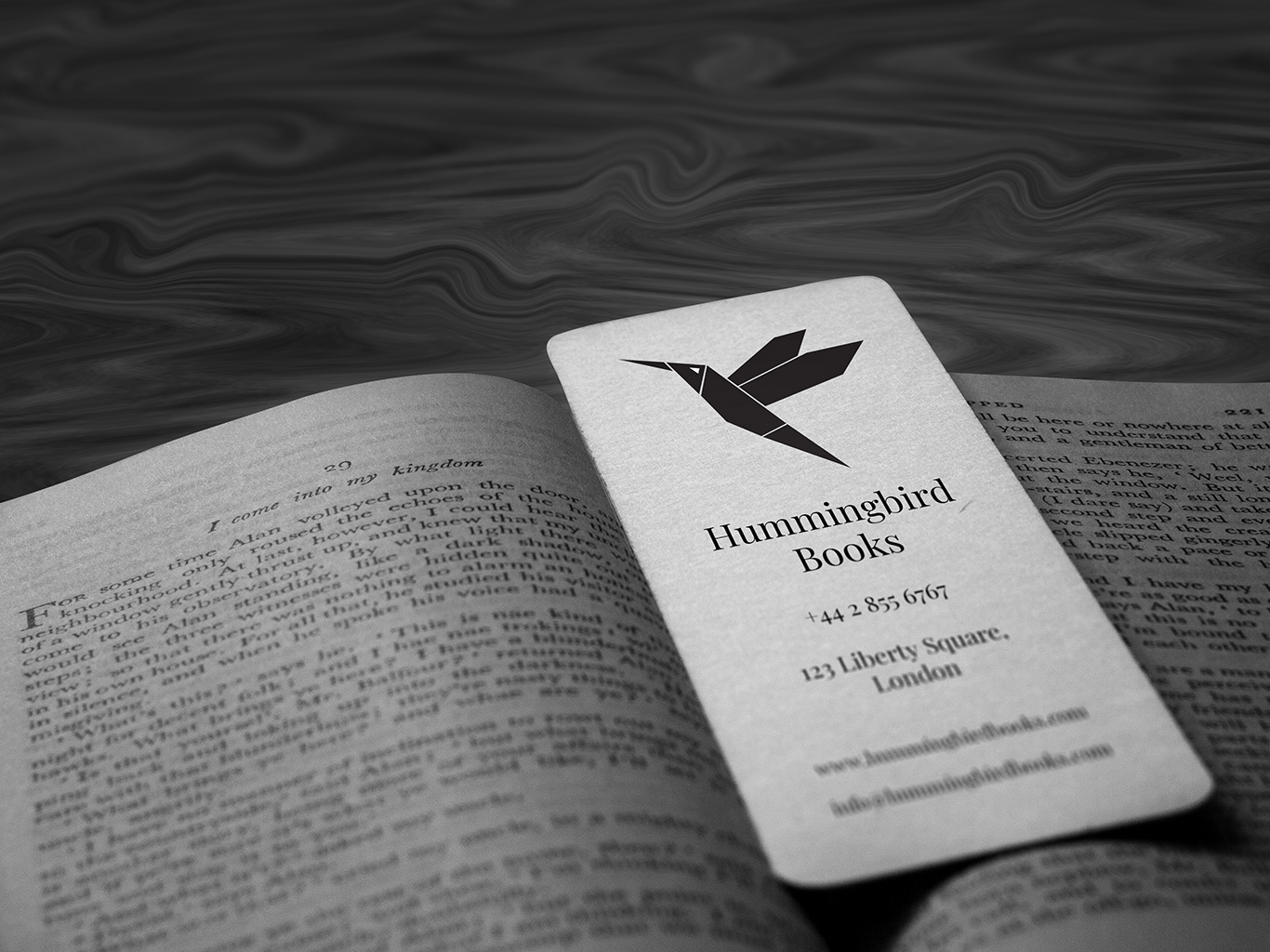
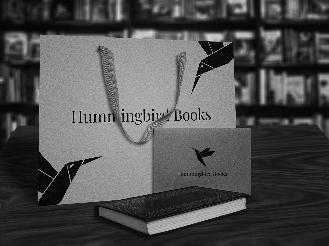
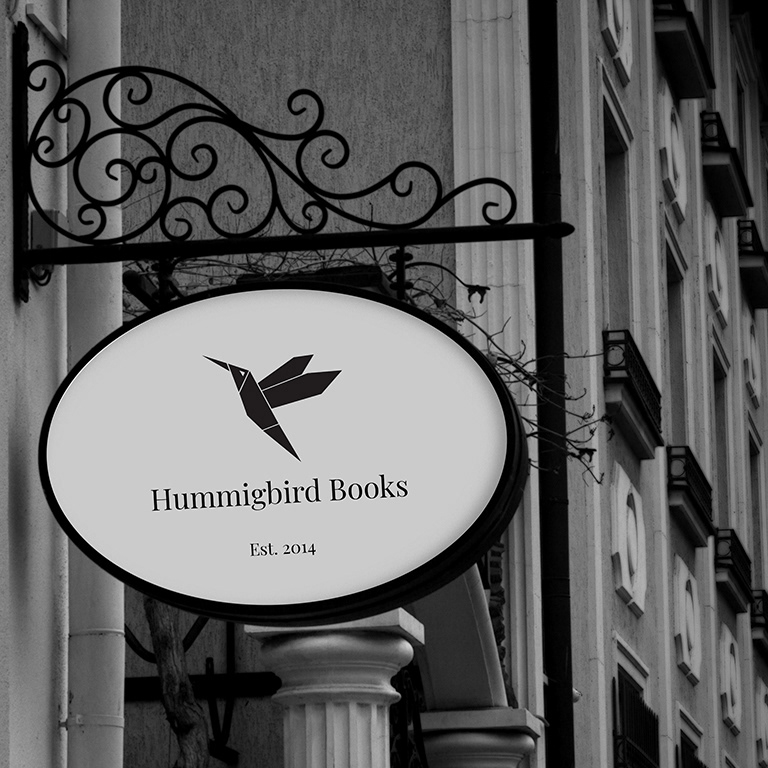
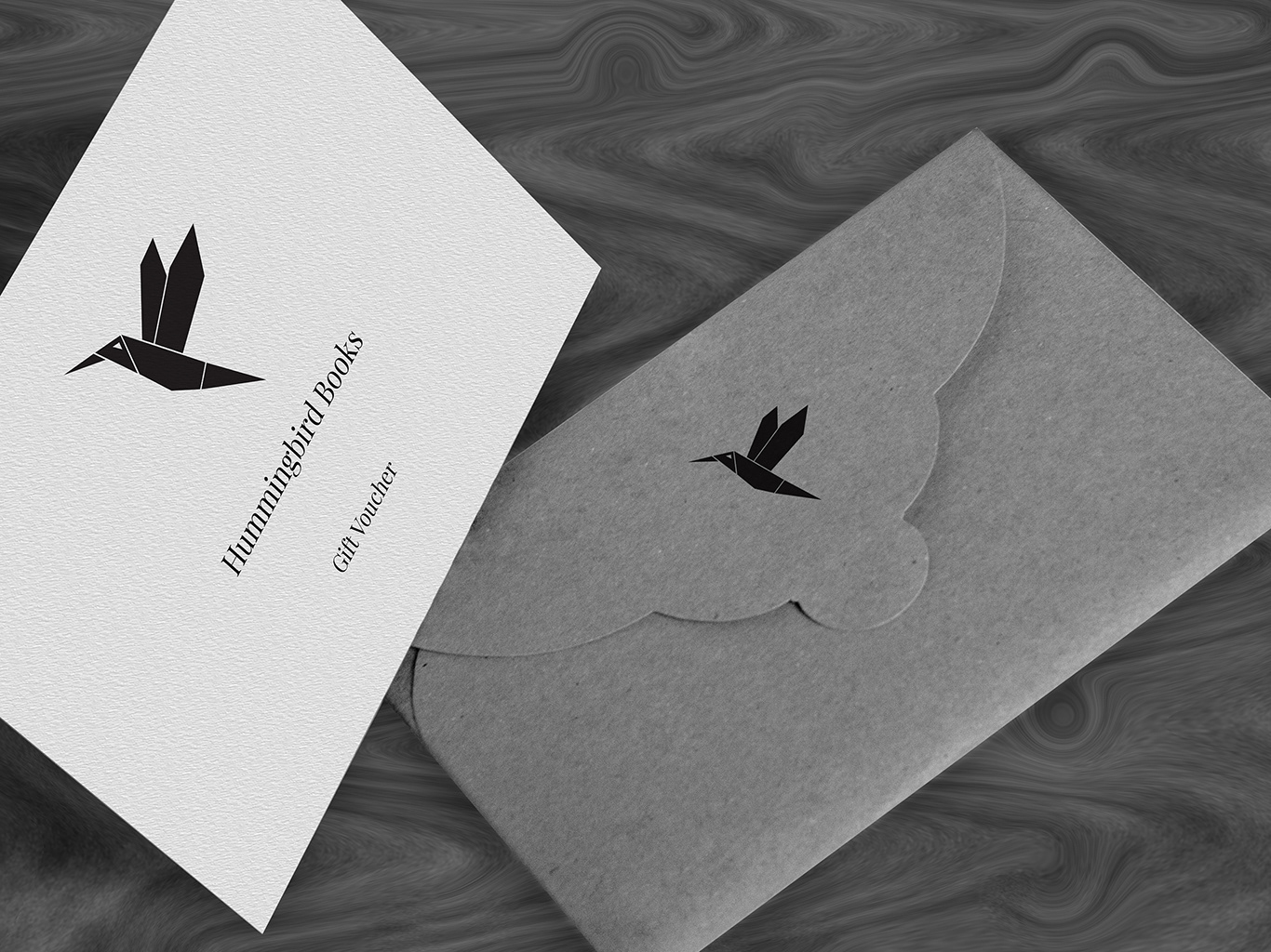
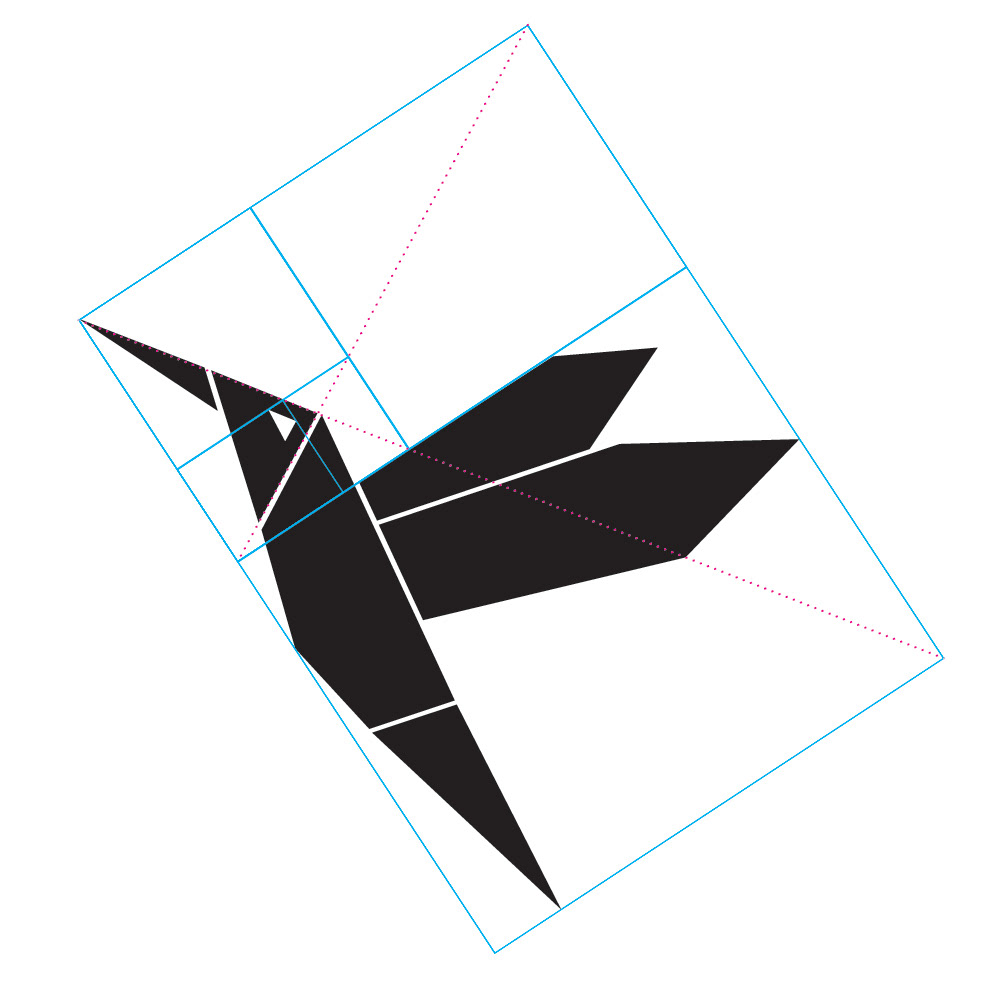
The origami-like logo comprises of clean geometric shapes. Made out of paper, the origami carries the notion of skilled hand work and style. Black and white colors directly connect to the contrast between ink and paper. This simple, yet robust combination, has the potential to relay the same strong messages in inverted colors as well.

The nature inspired symmetry is based on the golden ratio.
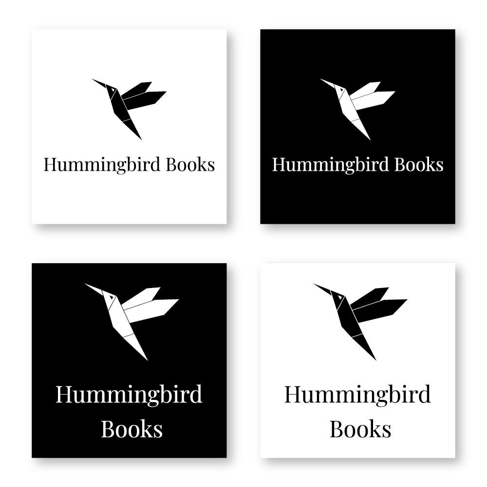
The logo is meant to be used isolated, or in combination with text. The elegant serif font is another element that relates to print work, and supports the overall concept. Type could be used in a single or double line versions, depending on the application.
Custom made mockups were prepared to demonstrate applications on industry specific items, and place the logo in a business-relevant context.