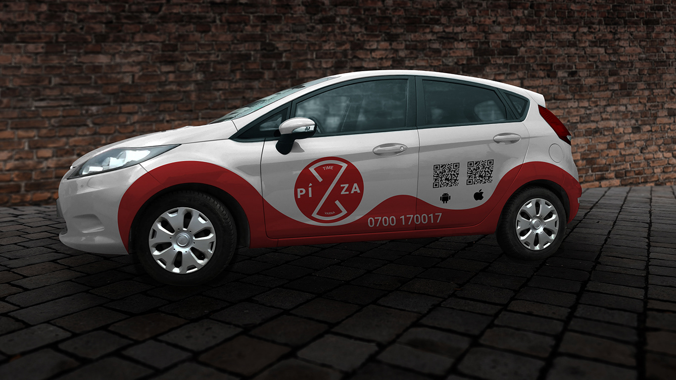
Pizza Time Varna Branding
It's never too late for pizza!
This assignment presented the challenge of designing a logo that makes a local pizza restaurant and delivery service stand out, while conveying a message that's relevant to the industry.
The main idea is centered around a Z-shaped line that plays four main roles:
1. It represents the word "Time" by resembling the shape of an hourglass;
2. It represents pizza slices within the surrounding circle;
3. It substitutes the first "z" in the word "pizza", and complements the sans serif font chosen for the purpose (Roboto).
4. It splits both the circle and the word "pizza" in equal symmetric parts.
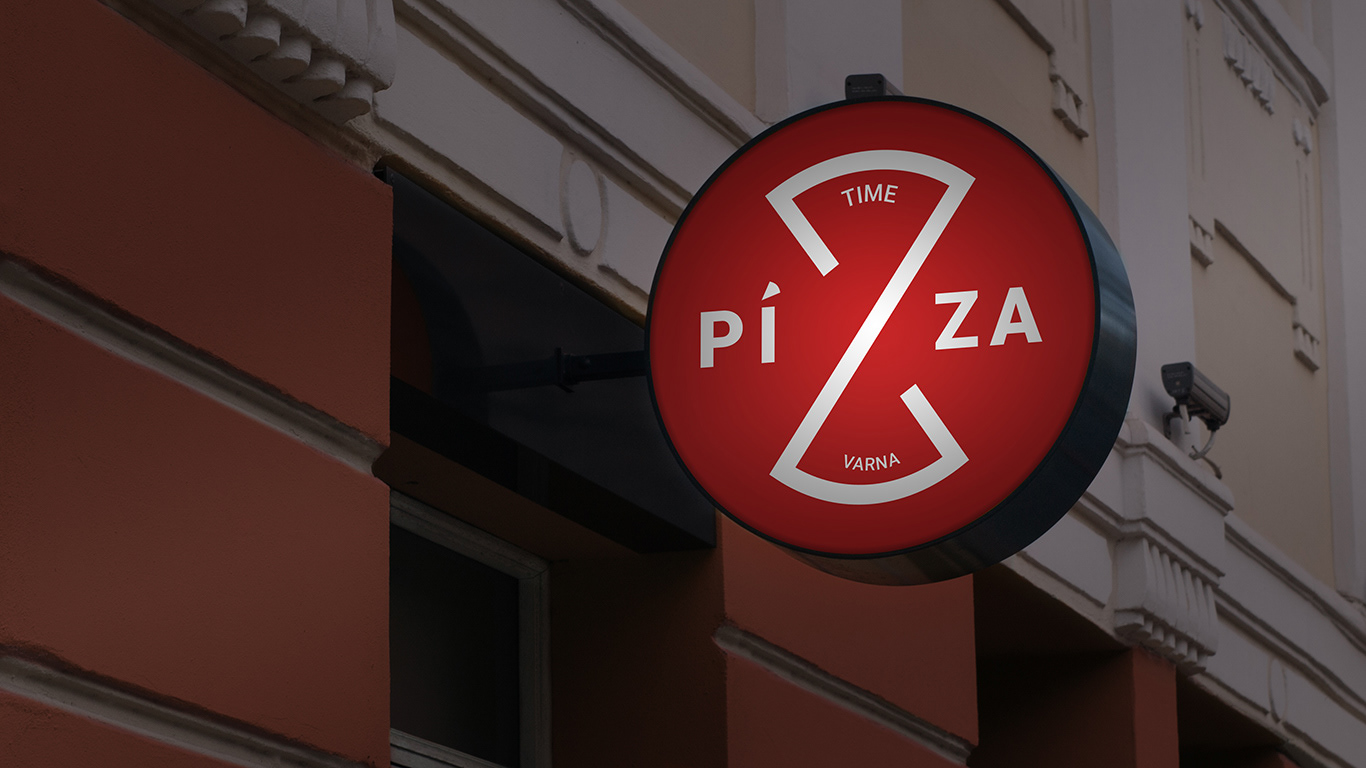
The logo has been made with readability in mind. Versions in color and black and white are equally acceptable, ensuring applicability on light and dark backgrounds alike. Simplifications, such as removing the smaller text, can be made to retain readability in tiny prints.
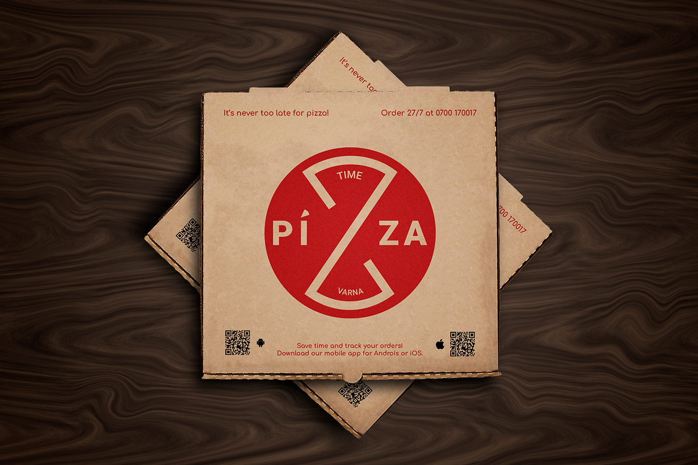
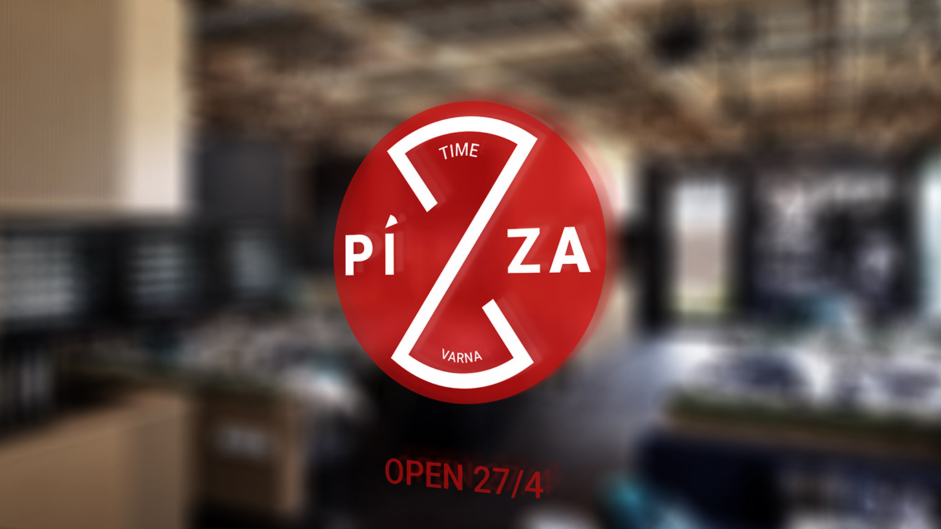
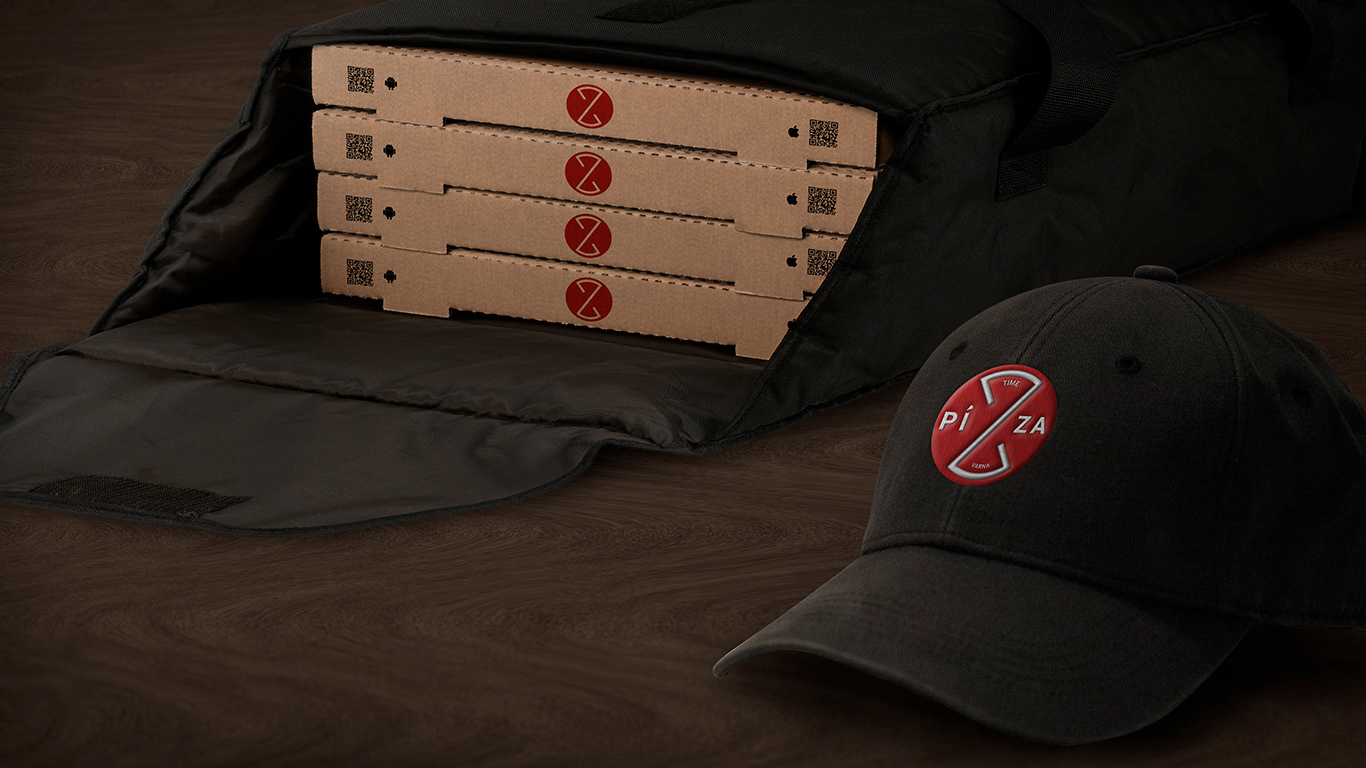
Custom mockups were made to demonstrate logo application in various sizes, and on different surfaces.
