Pizza Time Mobile App
A Study on Customizable Material Components
This pizza ordering and delivery app uses a wide range of material design components, some of which are rather ubiquitous. However, given the information architecture and the user flow, some of these components are defining for the user experience and greatly contribute to the product choice and ordering process. Let's have a look at the three major ones.
1. Bottom Navigation
The information architecture of the mobile app includes three top level destinations of equal importance - Menu, Orders and Profile. To make these easily accessible to the user at all times, a bottom navigation bar is used. The component uses text in addition to the icons, plus a highlight for the currently selected category.
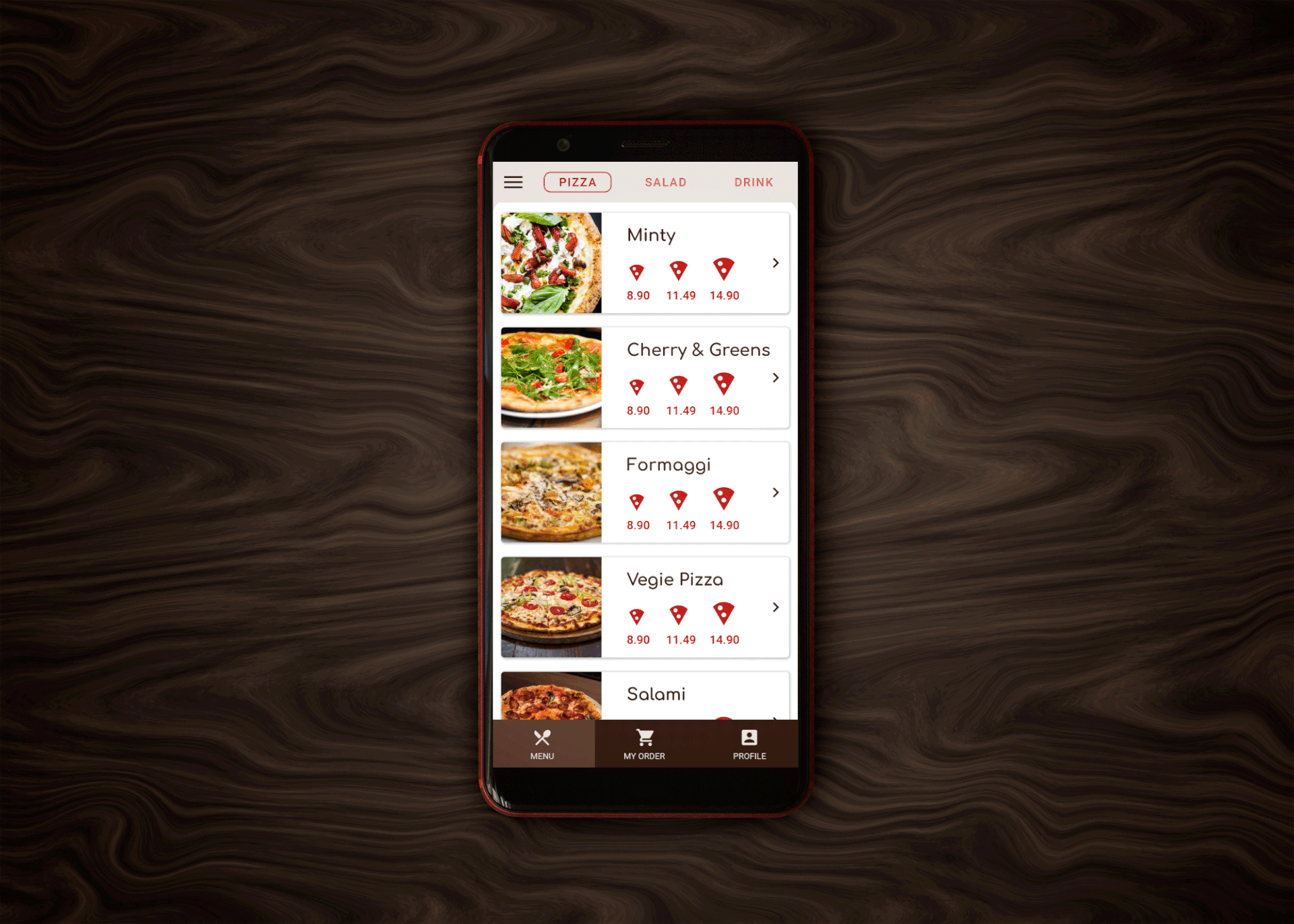
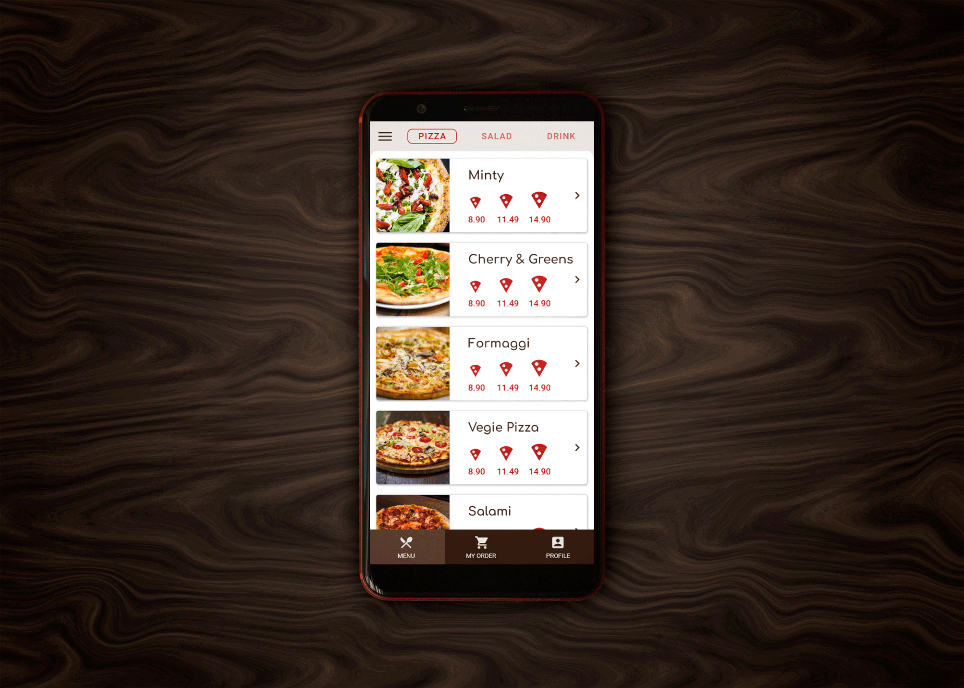
2. Fixed Tabs in the Top App Bar
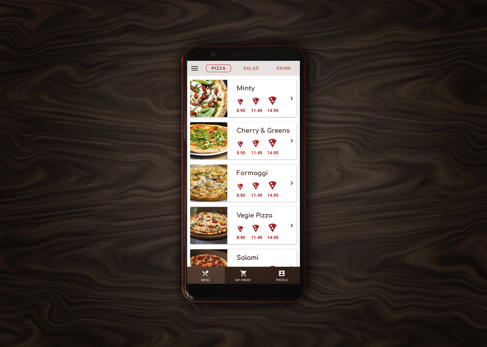
Within the Menu category, there are three content groups - pizza, salads and drinks. These are represented by tabs in the top app bar. This ensures visible separation and easier navigation between the subcategories that are at the same hierarchy level. The low number of menu item groups dictates that fixed tabs would be used, since the available space in the top app bar is sufficient to accommodate them without horizontal scrolling. Tabs are used only within this main destination, while the top app bar in the Profile and Order categories utilizes other elements.
3. Backdrop
Filtering of items by a set of criteria is a major requirement. It is motivated by the desire to speed up the selection and help the users to proceed faster to the next steps of the order process. Extended filters are also very demanding when it comes to real estate. Therefore a backdrop was chosen to accommodate the filters on a separate layer beneath the menu item list. A reveal affordance is used to slide down the front layer with the menu items, and show the back layer, where filters are ordered in three hierarchical levels:
a. Price filter that uses a slider to define the price range of the displayed items.
b. Filter by type that uses radio buttons to allow selection between mutually exclusive alternatives.
c. Detailed filter by that uses check boxes to allow various combinations (or exclusion) of ingredients.
In the back layer, filters from the upper categories affect the availability in the lower categories. For instance, selecting lactose free from the filter by type would automatically disable all lactose containing ingredients. Also, a reset button and indicator of the number of matching items are included, to ease the return to a starting point if the filters give too few, or no matches.
4. Other Components
In addition to the three main components that are considered defining for the user experience, the Pizza Time app uses various other components. Some of them, like the top app bar and various selection controls, were already covered partially in relation to the main three.
a. The top app bar is used across all categories. As mentioned, in the menu category it accommodates the tabs with the three main content groups. In Orders and Profile, the top bar contains a page title, a back button and overflow menu.
b. Selection controls like sliders, radio buttons and check boxes are used extensively for filtering content. They can be found mostly in the backdrop layer in the Menu category.
c. In addition, it's worth mentioning cards, which are used in different sizes, layouts and orientation across all main destinations in the app. All cards are expandable. The amount of available content prior to expansion varies greatly - from headline and icon in the Profile category, to images, price indicators, and explanatory text in the Menu category. Elevation is used everywhere, especially as a visual hint during expansion.
d. Buttons - just like cards, buttons are used across the entire app in their main variations according to the material guidelines - text, outlined, and contained.
e. Dialogs - used to indicate completion of actions, or to require a certain user action.