Dashboard for Online Payment Service
Recruitment Task Series
Here's another skill validation task, this time from iCard - a payment service provider with coverage in 30+ countries. The assignment was to redesign their online dashboard. A screenshot of the current state was shared for reference. No motives were given for the redesign, and no usage data or target audience were mentioned.
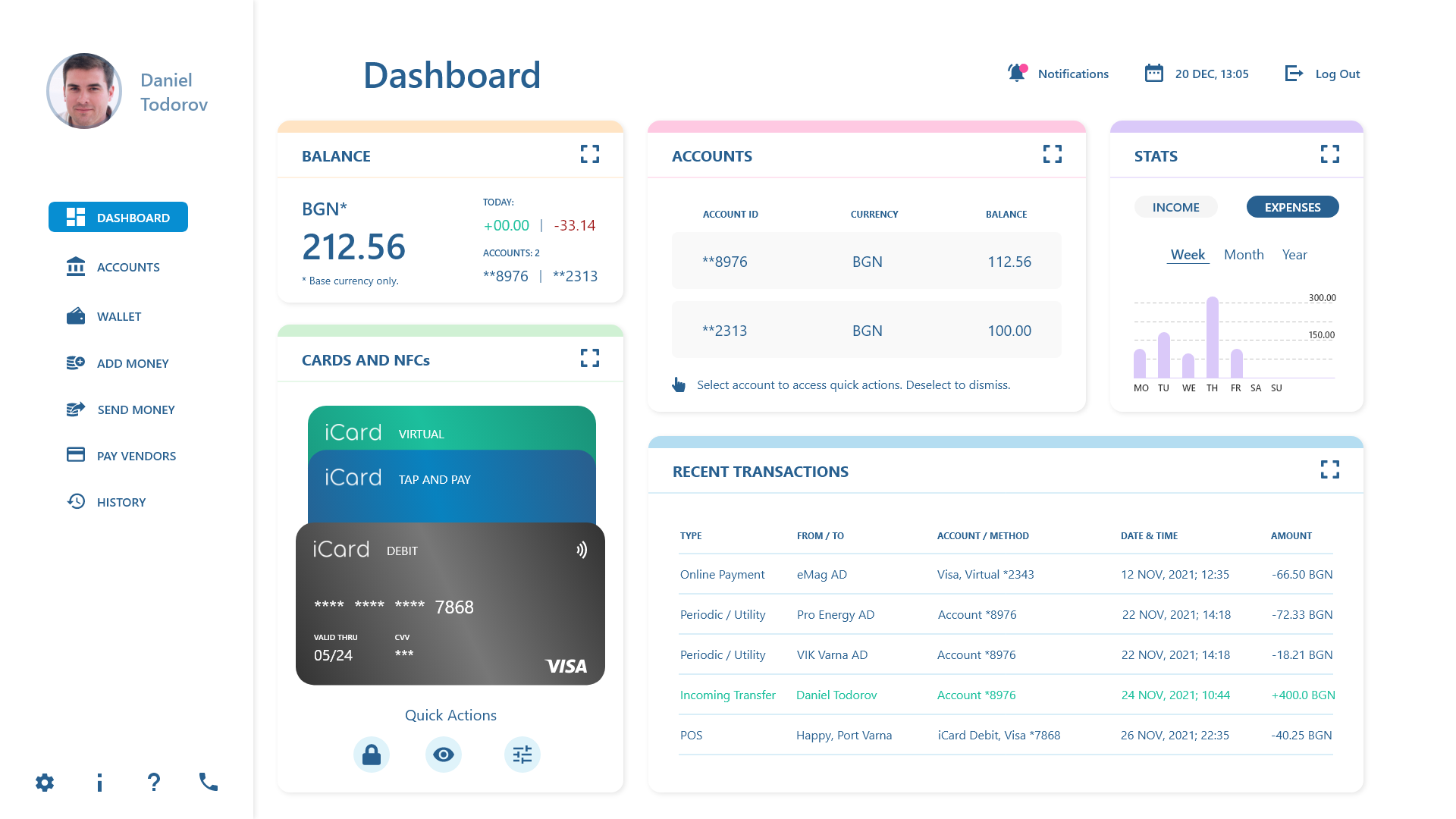
A proposed new look for the iCard online dashboard.
The Proposed Solution
There was a second task, which required the redesign of the wallet screen of the company's mobile app. Some of the decisions were made to ensure consistency between the mobile and the web app.
Introduction of Stats
Dashboards are commonly used for data display in combination with control panel functionalities. Since the existing solution lacks any data representations, I decided to bring stats to the mix.
Introduction of Notifications
This is a system feature that seems boring at first, but is actually quite useful. Notifications can be used to relay new information about anything system related. Examples include, but are not limited to, planned service interruptions due to maintenance, upcoming products or features, or account status updates. Since the original doesn't have this in plain sight, I decided to place a link to the inbox on permanent display, with an icon and a badge to indicate new incoming messages.
Quick Actions for Accounts
In the original, the overview of the user account contains limited information about the associated bank accounts. I decided to create a separate space for the bank accounts, and introduce more details and quick actions. This was taken from the original solution where similar quick actions are available for the payment methods.
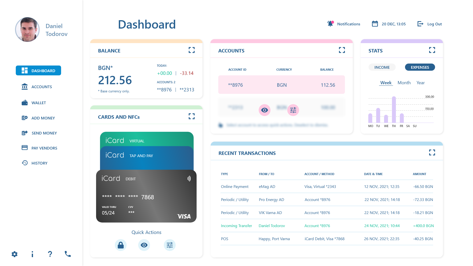
The redesigned iCard online dashboard, with quick actions introduced for accounts.
Simplifying the Navigation Drawer
The navigation drawer in the original dashboard uses black text accompanied by icons in different colors. I opted in for color uniformity between text and icons. Also, in the proposed solution all navigation categories have the same color. Color highlights were used for the dashboard cards instead, as explained in the paragraph below.
Also, in the proposed solution the profile picture and link are contained within the navigation drawer, to ensure better consistency with the modal variant on mobile. Last, some of the navigation categories were merged to keep things concise and avoid ambiguity and discrepancies between iconography and text.
Introduction of Color Highlights
Colors outside of the current corporate palette were brought in to serve as highlights for better visual separation between the different sections of the dashboard. The chosen combinations of hue and saturation were picked to make the highlights distinct from the navigation elements, while maintaining a level of subtlety.
This project demonstrates the work done on an actual recruitment task. No NDA was signed during the skill validation process and I'm under no obligation to keep my work secret. To maintain brand consistency I used the iCard logo and associated brand colors, as well as the VISA logo. With my work I clam no ownership over (or contribution to) the brand assets and original content by iCard or VISA.