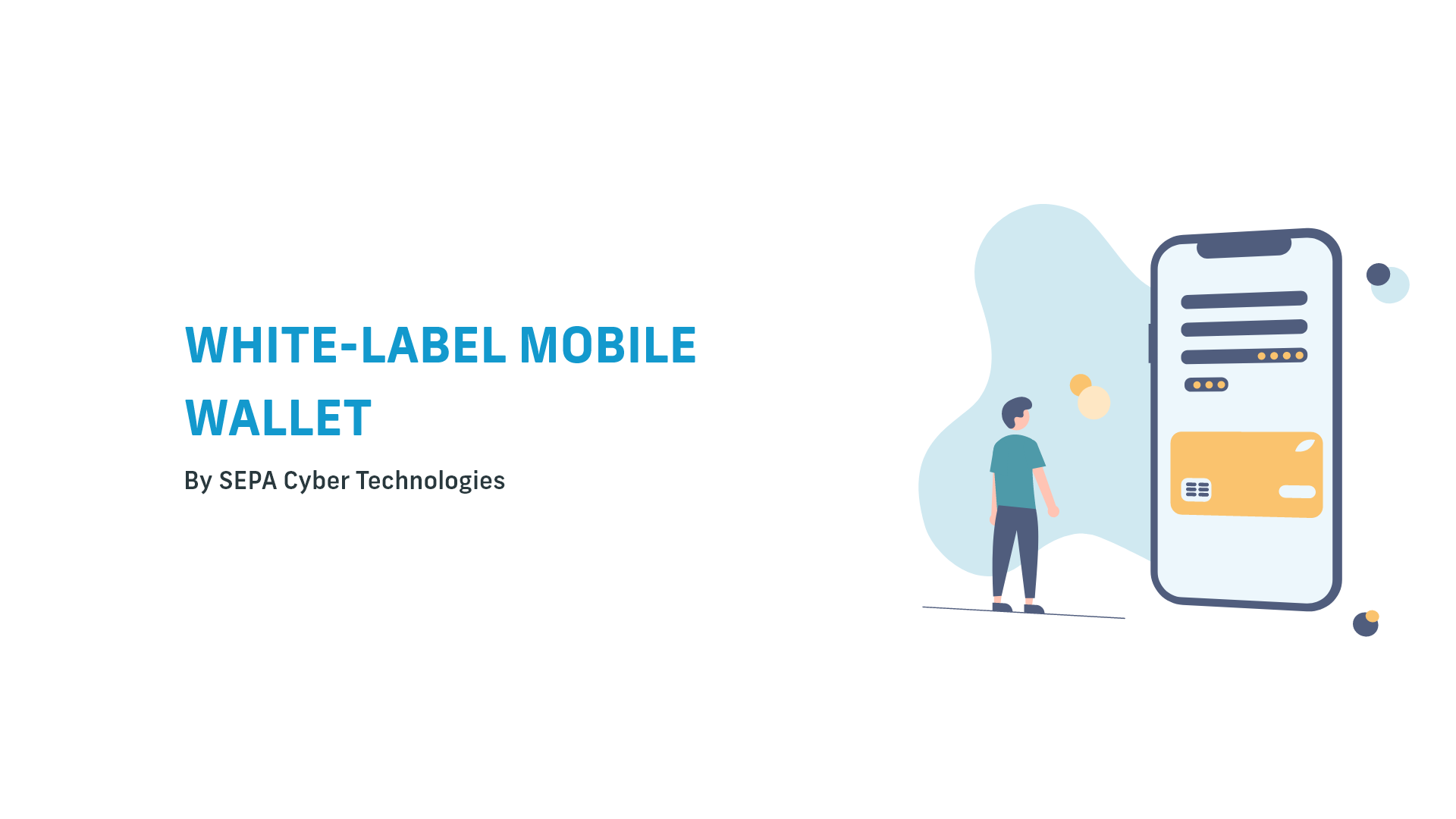
Redesign: SEPA Cyber Technologies
Product Page
Recruitment tasks series
Here's another recruitment task that I did after my application at SEPA Cyber Technologies was shortlisted. The assignment was to redesign the company's digital wallet page. I was given guidelines about the overall vibe of the page and the importance of the content in the context of the company's business model.
Detailed brand guidelines were provided as well. These covered logo anatomy and usage, brand colors, illustrations, iconography, photography, and additional elements. The corporate font was included in the package too. No audience data or page usage data were provided. Also, no specific pain points were outlined to motivate the redesign.
Main Decisions
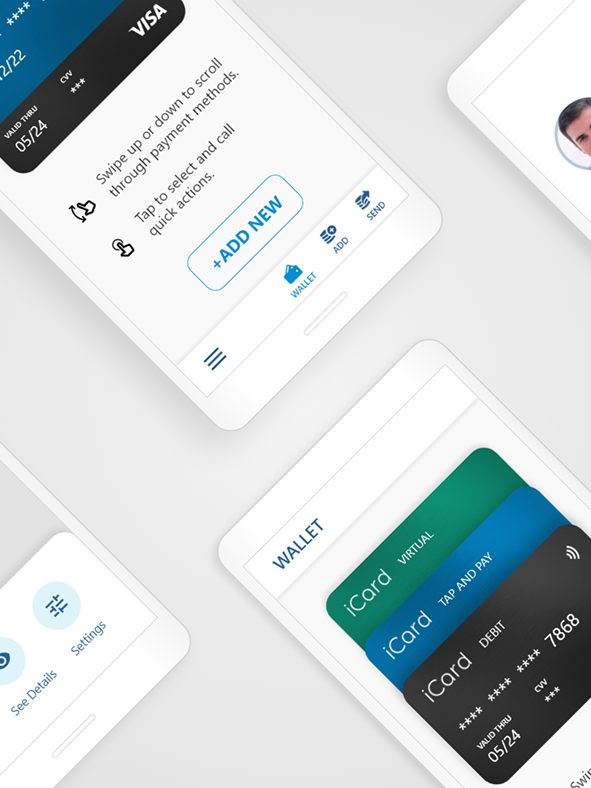
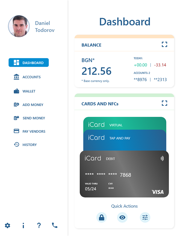
1. Column grid adjustment - a 16 column grid is used, with the rightmost and leftmost 2 columns serving as margins. The idea is to have an 8 column grid (16/2), which allows splitting the screen (or areas of it) in ratios based on the numbers in the Fibonacci sequence (2:1, 3:2, and 5:3).
2. Extensive usage of vector assets - the content is accompanied by illustrations, primary icons, and secondary icons, for better visual cues.
3. Introduction of navigation drawer - the idea is borrowed from the material design guidelines. The purpose is to make the top bar more discrete, while making the navigation categories easily available with a click of a button.
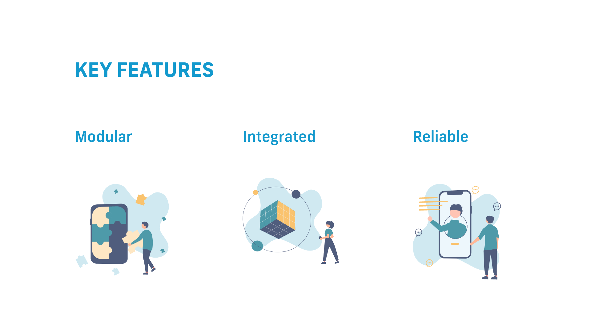
Vector Illustrations
Vector Graphics are used to illustrate the main product features. The illustrations are customized and color graded to fit in the brand guidelines.
1. Modularity - the brand guidelines outline the puzzle piece as a key shape to represent product features. This is not utilized on the original page, which presents an excellent opportunity to introduce something new, that makes a difference and fits the brand identity.
2. Integration - the SEPA Cyber digital wallet is a part of an entire ecosystem of B2B fintech solutions. Clients can order custom integrations of any combination of products, that work within a common framework.
3. Reliability - this relates to guidance and support during set up.
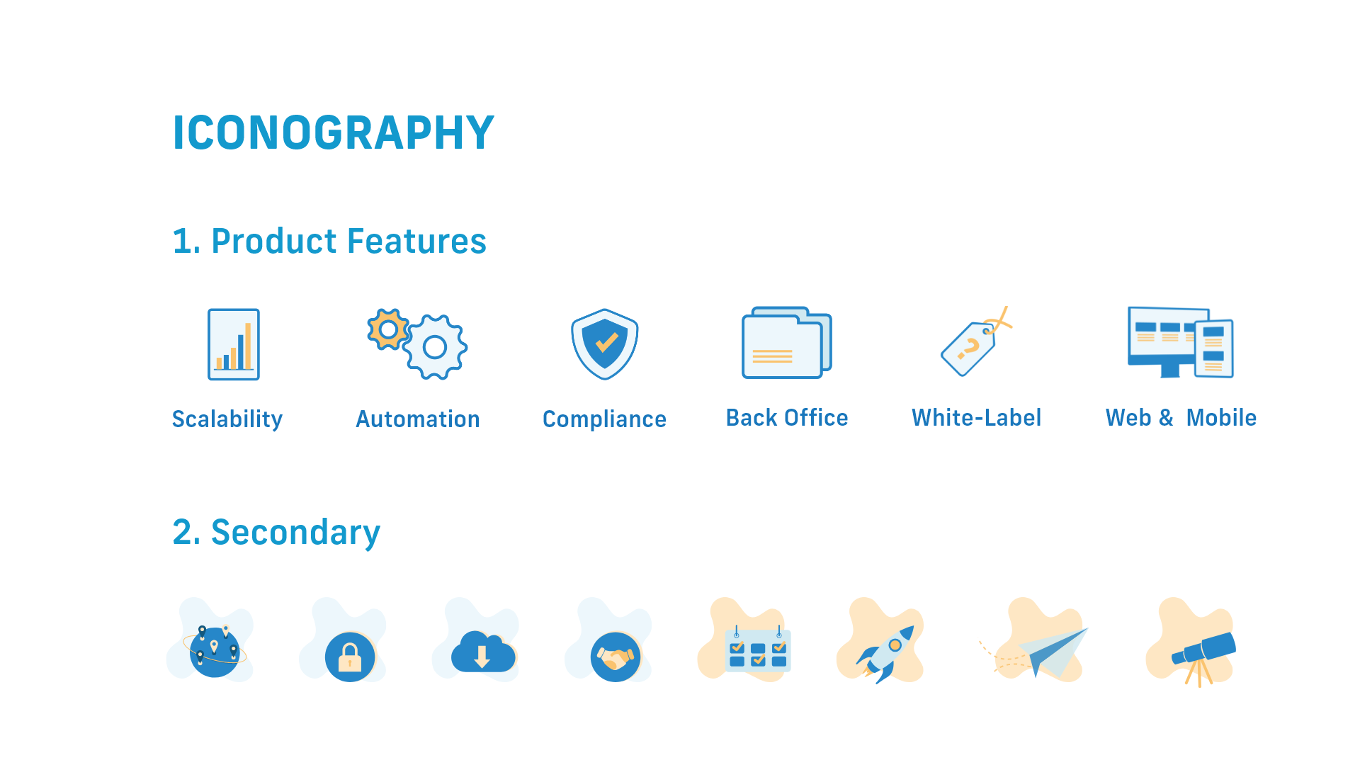
Icon Sets
In addition to the vector illustrations, two sets of icons are used for additional visual cues. These are based on the originals on the page, but modifications were made for better uniformity of style and better relevance to the accompanying content. The spot used in the secondary icon set is also present in the larger illustrations, and is taken from the brand guidelines.
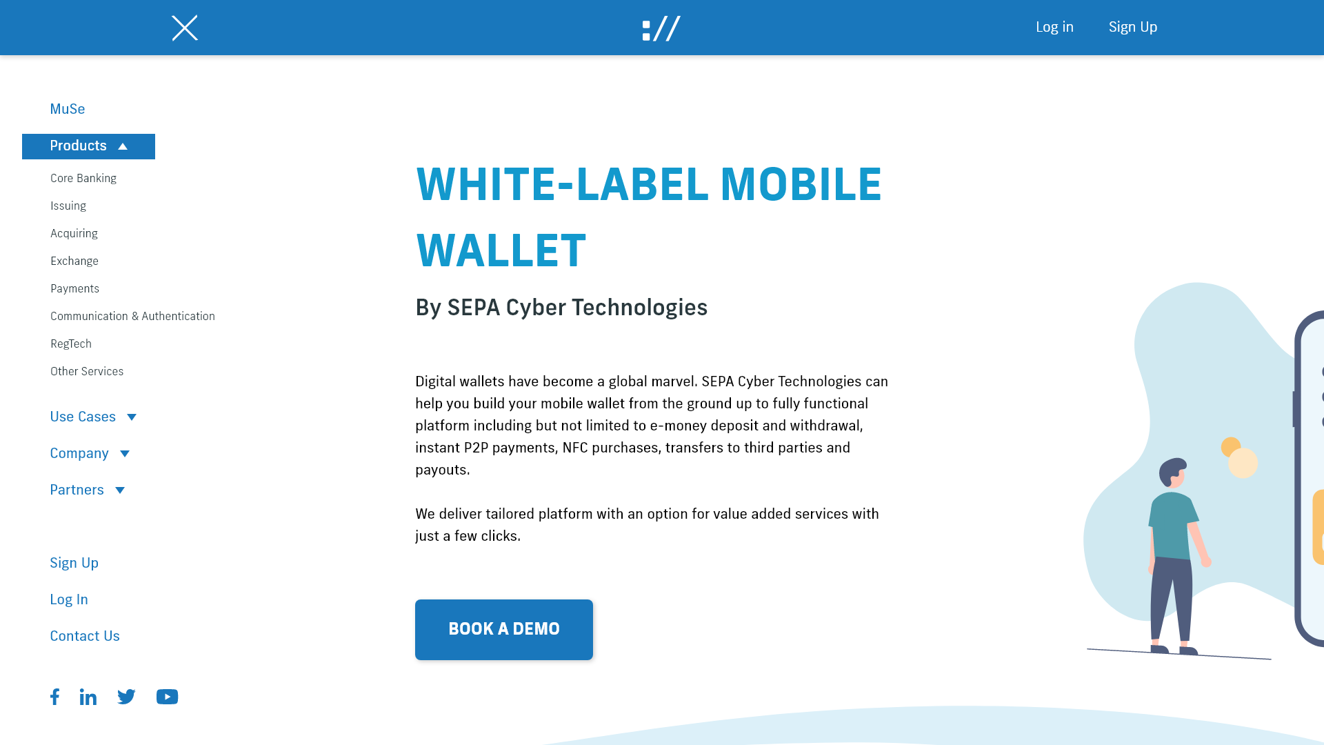
Navigation
As mentioned above, a navigation drawer is introduced to host the navigation links. The reason is that the company logo is not readable in small sizes and doesn't allow shrinking of the top bar. To resolve this, I decided to use a narrow bar at scroll down, which includes only the execute sign (://), and not the entire logo. This is acceptable according to the brand manual.
The navigation drawer pushes the content to the right, which is better in terms of readability, compared to the dropdowns in the original, that hide the content. The drawer is scrollable, and the categories are expandable.
Page Prototype
The preview below is of a prototype that presents the entire page. It's scrollable, and is made to demonstrate how the discussed elements are integrated within the whole thing. Even though it has some micro interactions wired, it's not meant to be a full blown hi-fidelity prototype.
No NDA was signed during the recruitment process and I'm under no obligation to keep my work secret. The assignment was to redesign the page while using the same content, and observing the provided brand guidelines. With my work I clam no ownership over (or contribution to) the brand assets and original content by SEPA Cyber Technologies.