Portfolio Showcase for Photographers
A simple attempt to bring some images to life
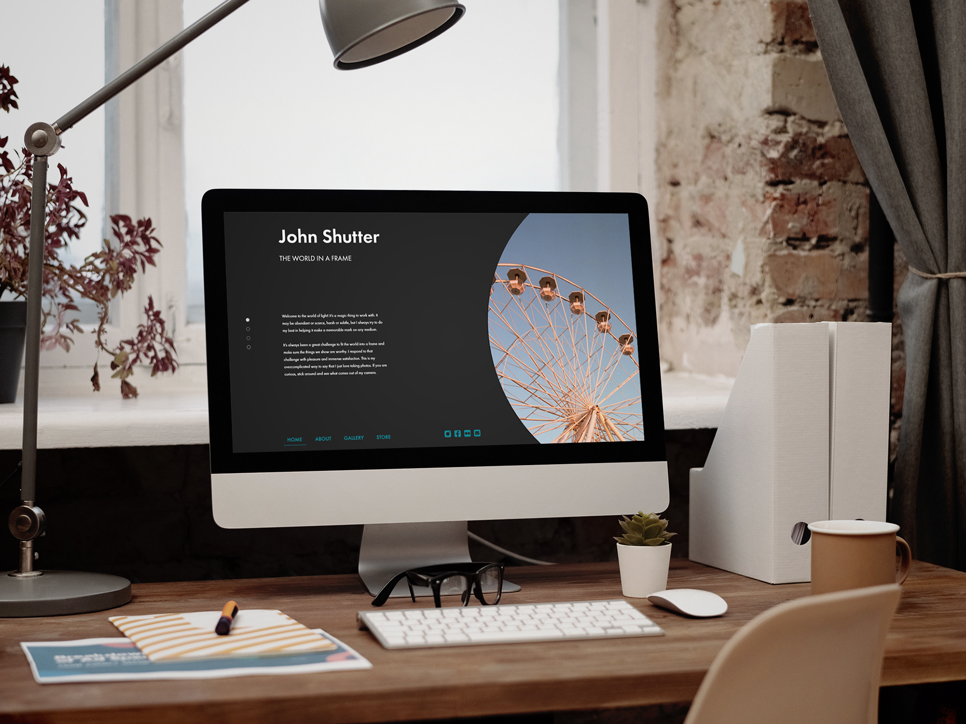
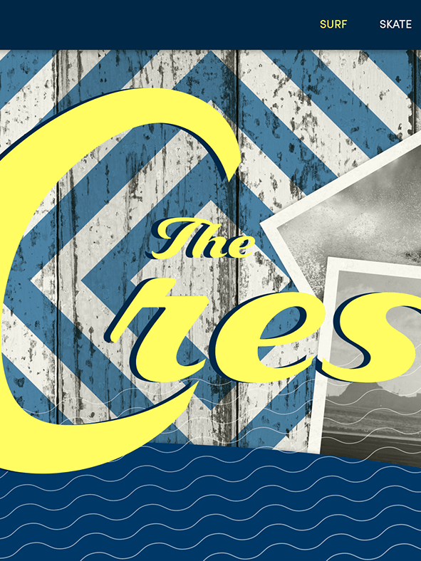
This mockup was made with a background photo by Mikael Blomkvist from Pexels.
This project focuses on spacious screens with emphasis on images. The visual hierarchy is achieved mainly through strong contrast between type sizes and abundant spacing. Colors and color variations are scarce, and the templates rely on neutral color that makes the images pop out.
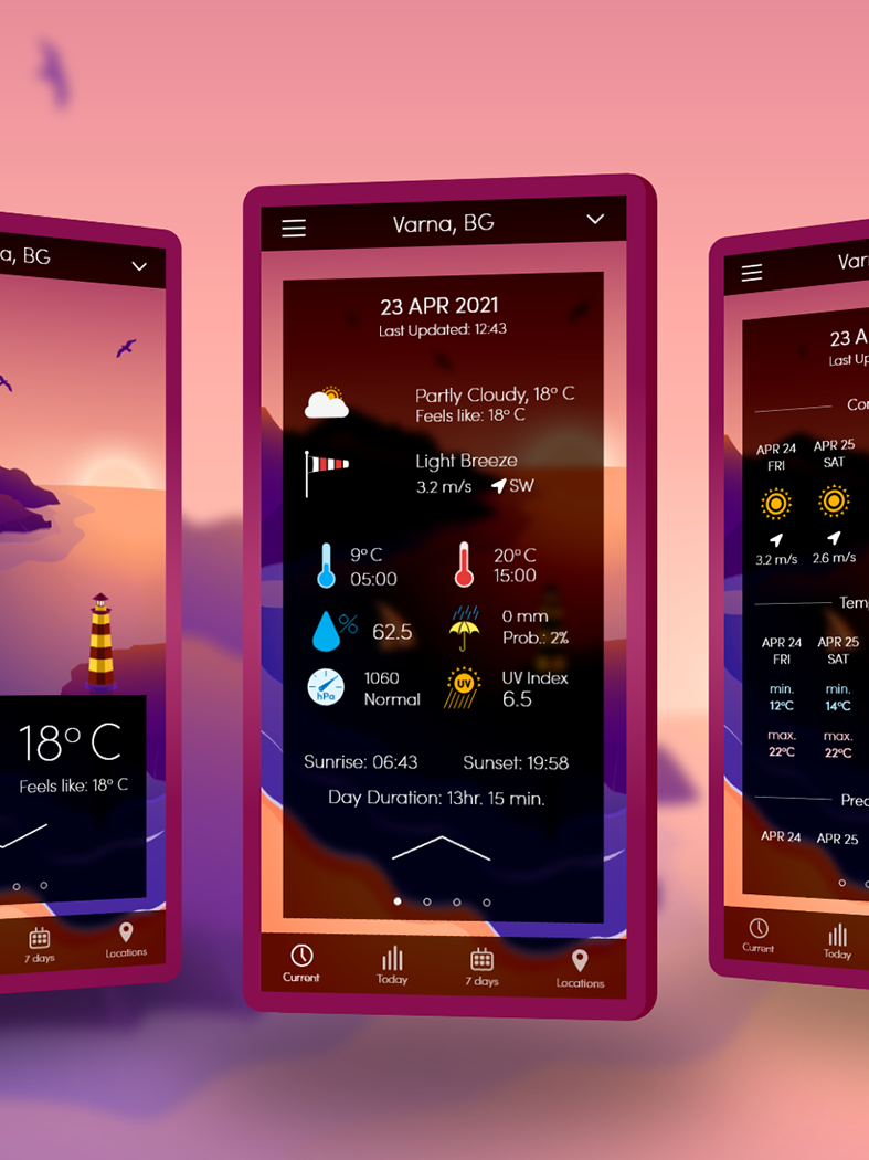
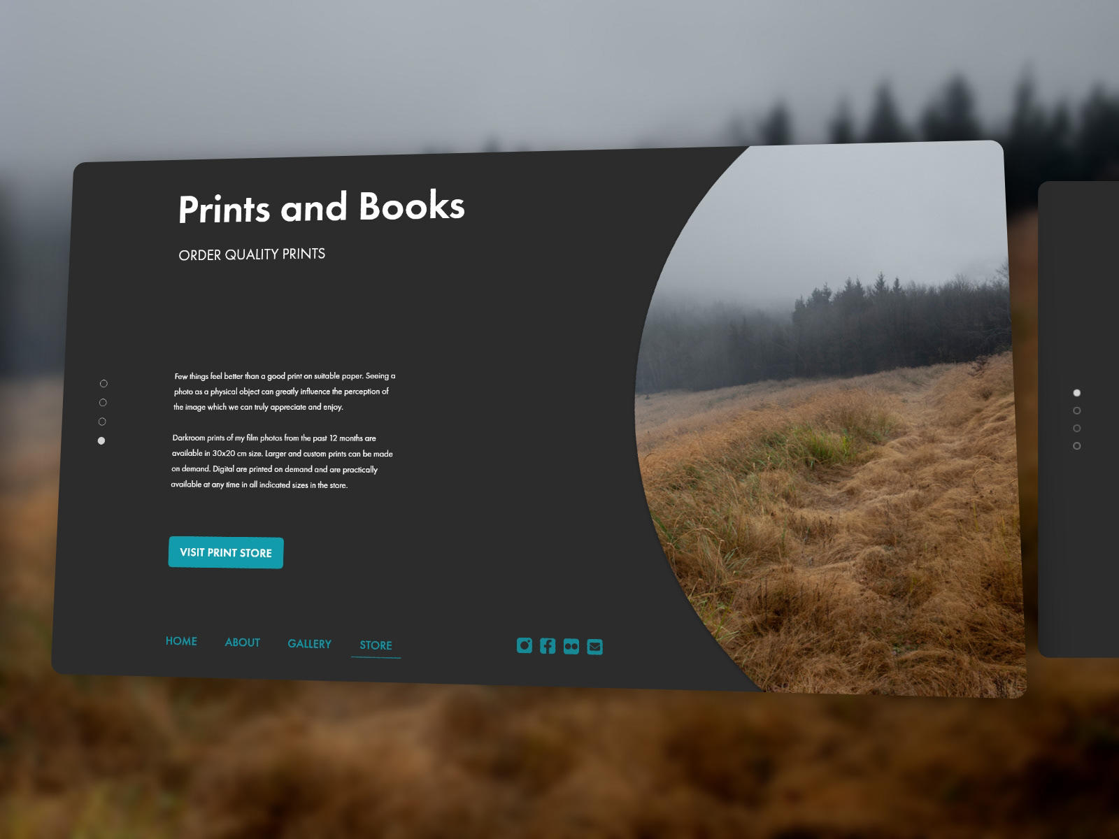
Three main visual cues are used to indicate the user's location in the content and the possible actions. These are a vertical page indicator, a navigation bar with underlining of the current page and alternating images to the righthand side of the screen.
Screen variations with alternating images, and page indication to enhance the visual cues for the user about his location.
The background is consistent, dark and neutral, with white type over it, to ensure text legibility and optimal image perception. Only a few text elements that are related to navigation are given a different color.
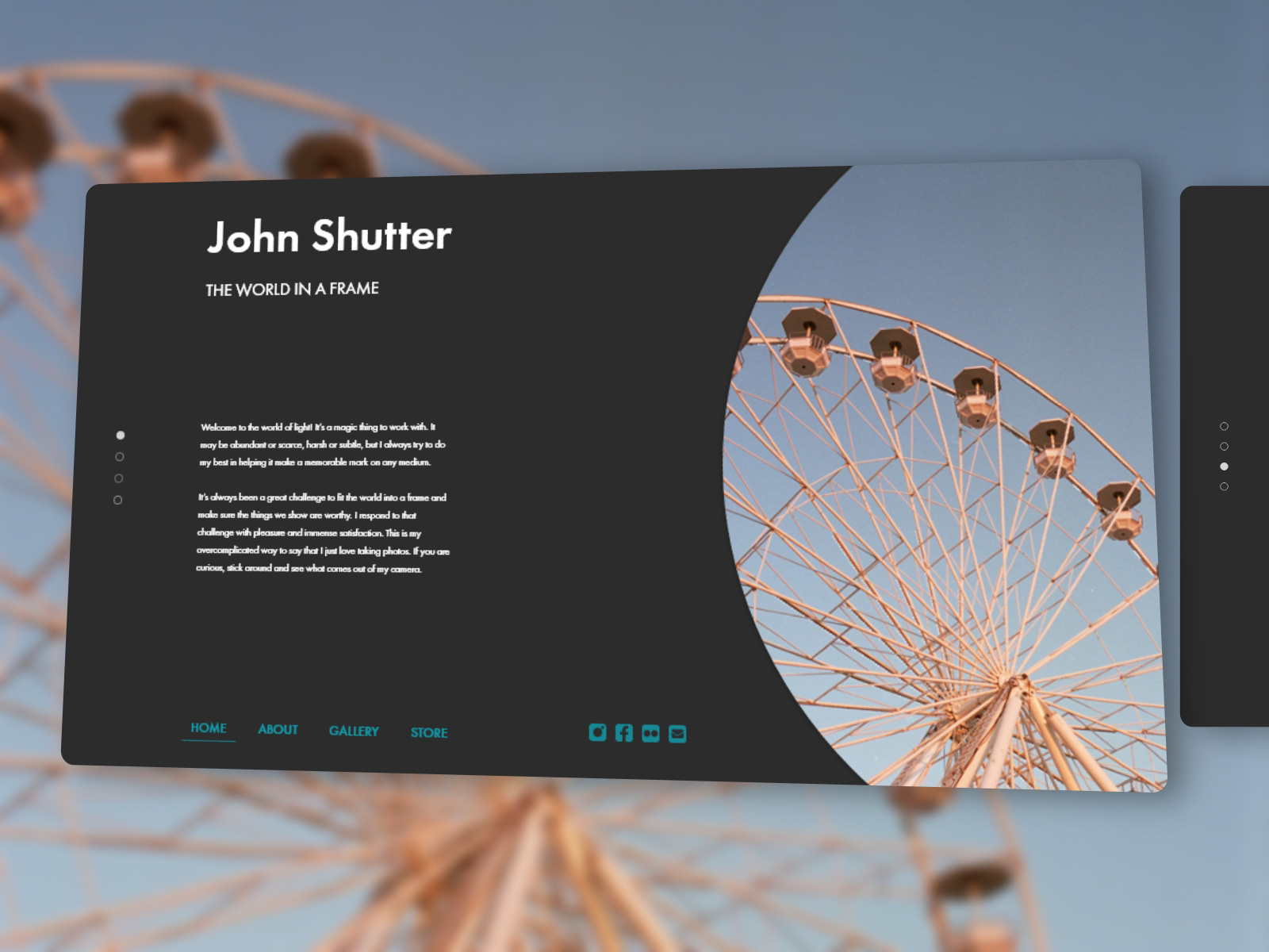
The navigation menu is placed at the bottom of the main screens, to allow immediate appearance of titles and subtitles on top of every page. As we delve deeper into the information architecture, we come across alternative menu content and placements that are contextual and dependent on the topic of the given page. Coloring, and the underlining of the active categories, however, remain consistent.
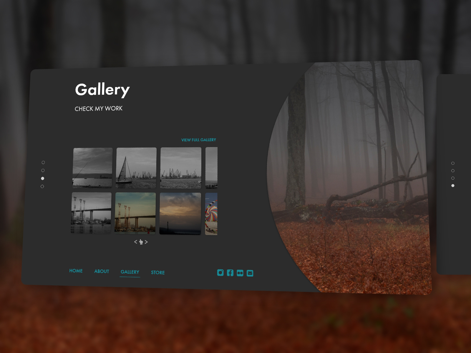
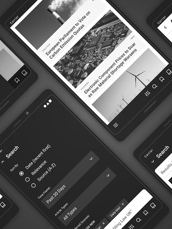
The images to the right side of the screen expand to reveal an overlay menu for a quick access of pages that are deeper in the hierarchy. The expansion is from 3 column width when idle, to 5 column width when active. For reference, the entire layout is based on 8 columns, with 16px gutter and without margins. This and more interactions can be seen in the prototype imbedded below.
The design is made with the user interactions in mind. Below you can see a prototype with detailed wired interactions where you can explore more page types and test the transitions between different screens and overlays. There are two important things to keep in mind while browsing the prototype:
1. The transitions in this web preview may not be as smooth as they are in the application used to wire the prototype (Adobe XD).
2. Not all possible interactions are wired, as the goal of the prototype is to complement the design, and not to be a functional live website.
Nevertheless, it's worth checking to see a larger variety pages in this design that are not showcased above. Enjoy!