Redesign: BNP Paribas Product Page
Recruitment task series
Recently I've been applying actively for positions related to experience design. I managed to pass the initial stage of selection a few times, and got to the point where my skills had to be validated. After four applications and a total of seven recruitment tasks completed, I decided to publish some of this work.
The first task I did was given by a company called CSoft. They have proprietary fintech solutions that they sell as white label products to banks. The deliverable I had to submit was a redesign of the Deposits page on the BNP Paribas Bulgarian website. The motivation behind the redesign was not clarified in the task. Also, no page usage or audience data was provided. I assume the idea was to throw me in the wild and see what I would do.
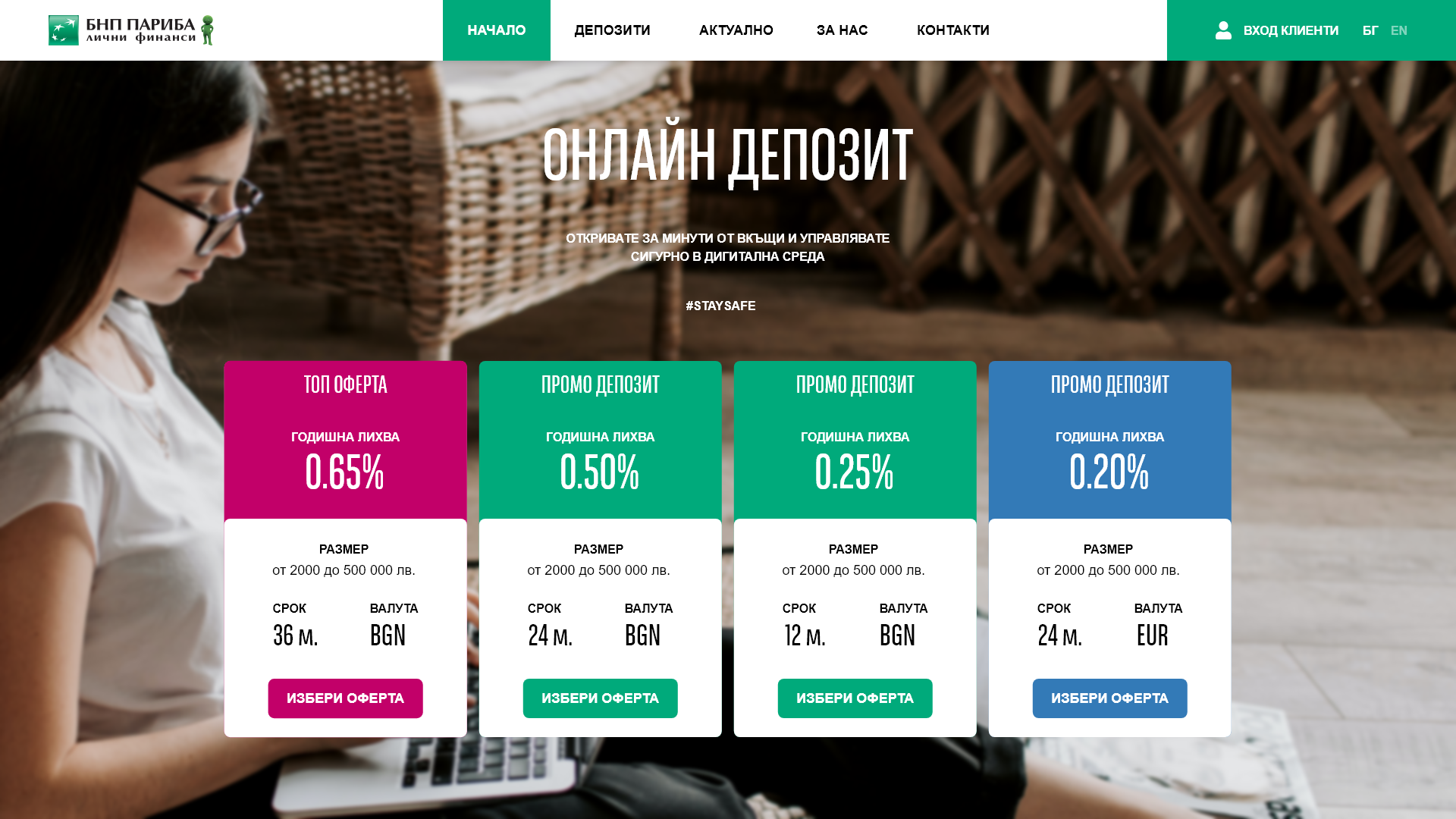
The ATF section of the new page design.
Problems spotted
Naturally, I used as a starting point what was already known - the content and the current layout. The content was supposed to be invariable, so I focused on examining the layout. As someone who ventures in the realm of experience design I focused on potential UX issues rather than on aesthetics.
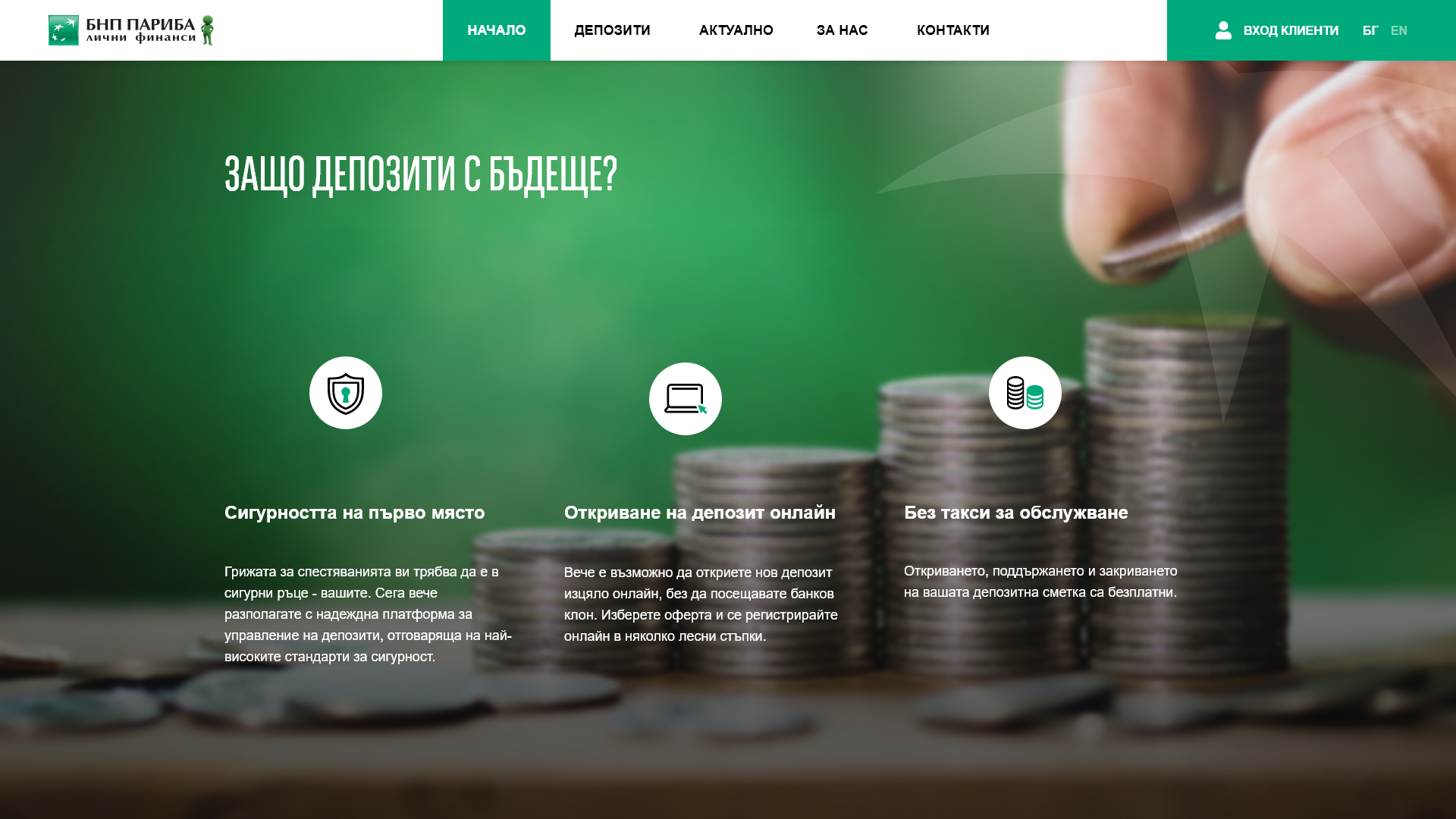
The section with product advantages.
Here are some of the pinpoints that I thought were worth giving a thought:
Accessibility and Prominence of CTA Buttons
The typeface chosen for the CTAs in the buttons is too condensed to be readable at its original size. Also, the buttons need more weight.
Hierarchy in Type Scales
A quick source inspect with the browser dev tools revealed that heading scales jump from H1 straight to H3.
Potentially Misleading Elements
In the original, the term and currency of the offer cards are highlighted in a way that makes them look like buttons. Also, the proximity and formatting of "annual interest" and the deposit size limits made them look connected, according to the gestalt principles.
Unexplained Hierarchy of the Client Testimonies
In the original, one of the client quotes is on a larger card with a more vibrant color highlight, which is not justified given the content and the semantics.
Balance and Negative Space Issues
These are seen mostly in the cards in the News section, the FAQ and the footer. The cause is apparently the disparity between the volume of content in the different columns.

The BNP Paribas deposits page has client testimonials.
Decisions Made
1. The content was rearranged to allow each section to take the entire screen. This was done to ensure more focus, less interference, and more space.
2. Different full screen images were used as backgrounds for each section of the content.
3. The content of the main navigation, the login link, and language toggle, were merged together within the same top bar. For that purpose the content was extended to take the full width of the screen, as opposed to being limited to the width of the grid, as in the original.
4. Special attention was given to the ATF zone. All actionable elements (offer content and CTAs) that have the potential to drive new business were moved there.
5. The navigation links, the H1, and the subtitle were center aligned, to form a funnel that points down to the offer cards.
6. The image in the ATF zone was selected and placed in a way that the subject's glance points at the critical content (offer cards).
7. A new Type scale was created to fix some of the known issues. The corporate font was used for H1 and H2 headings. Arial was used for everything else, including CTAs. This basically resolved all type and scale related problems while using the same fonts as in the original.
8. The Footer and the FAQ at the bottom were reordered.
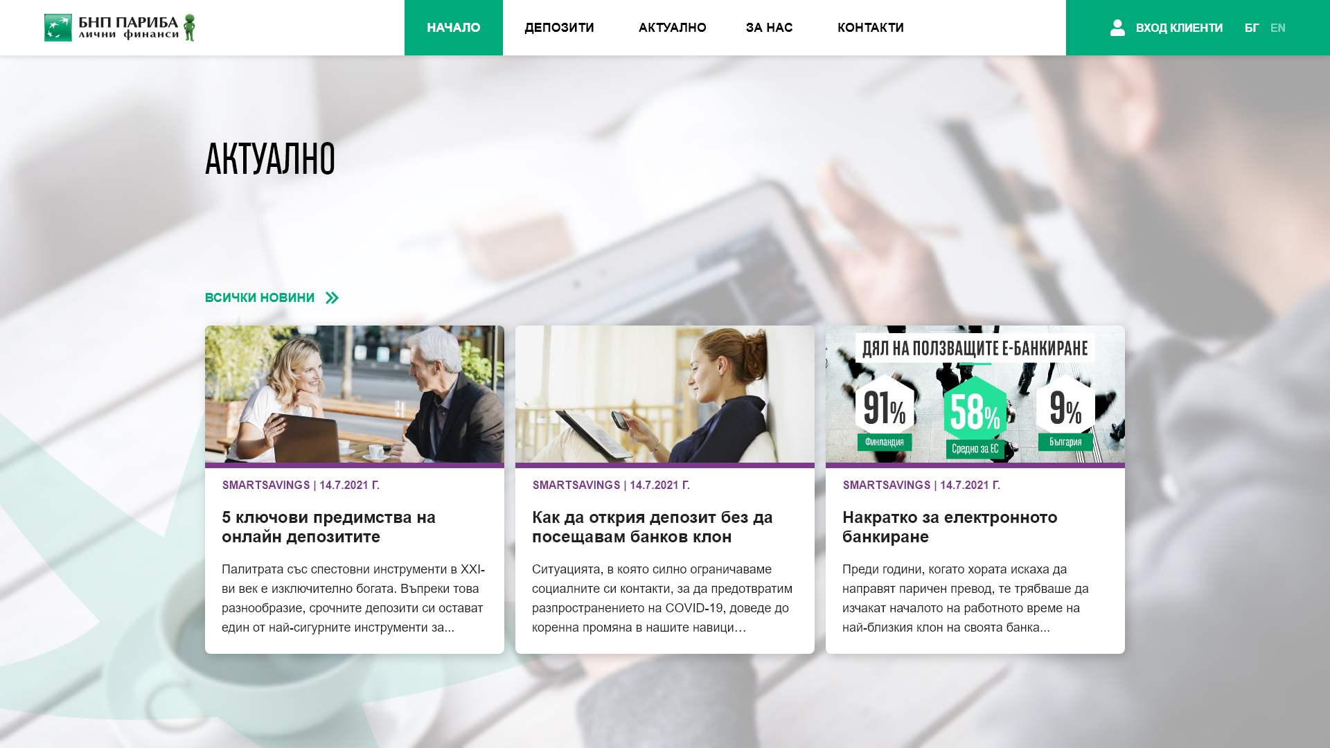
News section with articles about deposits and savings.
No NDA was signed and I'm not under formal obligation to keep my work secret. The assignment was to redesign the page while using the same content, and observing brand consistency. Therefore, BNP Paribas brand assets (logo and typeface) were used without modification, and in the same form that was publicly available on the original page at the time. Images from the original content were also reused. With my work I clam no ownership over (or contribution to) the brand assets and original content published by BNP Paribas.
A big thank you to the photographers whose work made this project possible. You can find them on Pexels.com, and they are: Tima Miroshnichenko, Vlada Karpovich, Sakchai Ruenkam, and Kamboopics.