SaaS Onboarding Sequence
Recruitment Task Series
This assignment was done for a company called Gtmhub. They offer an SaaS solution for OKR management. The task was to propose an onboarding sequence for their online platform based on brief audience data.

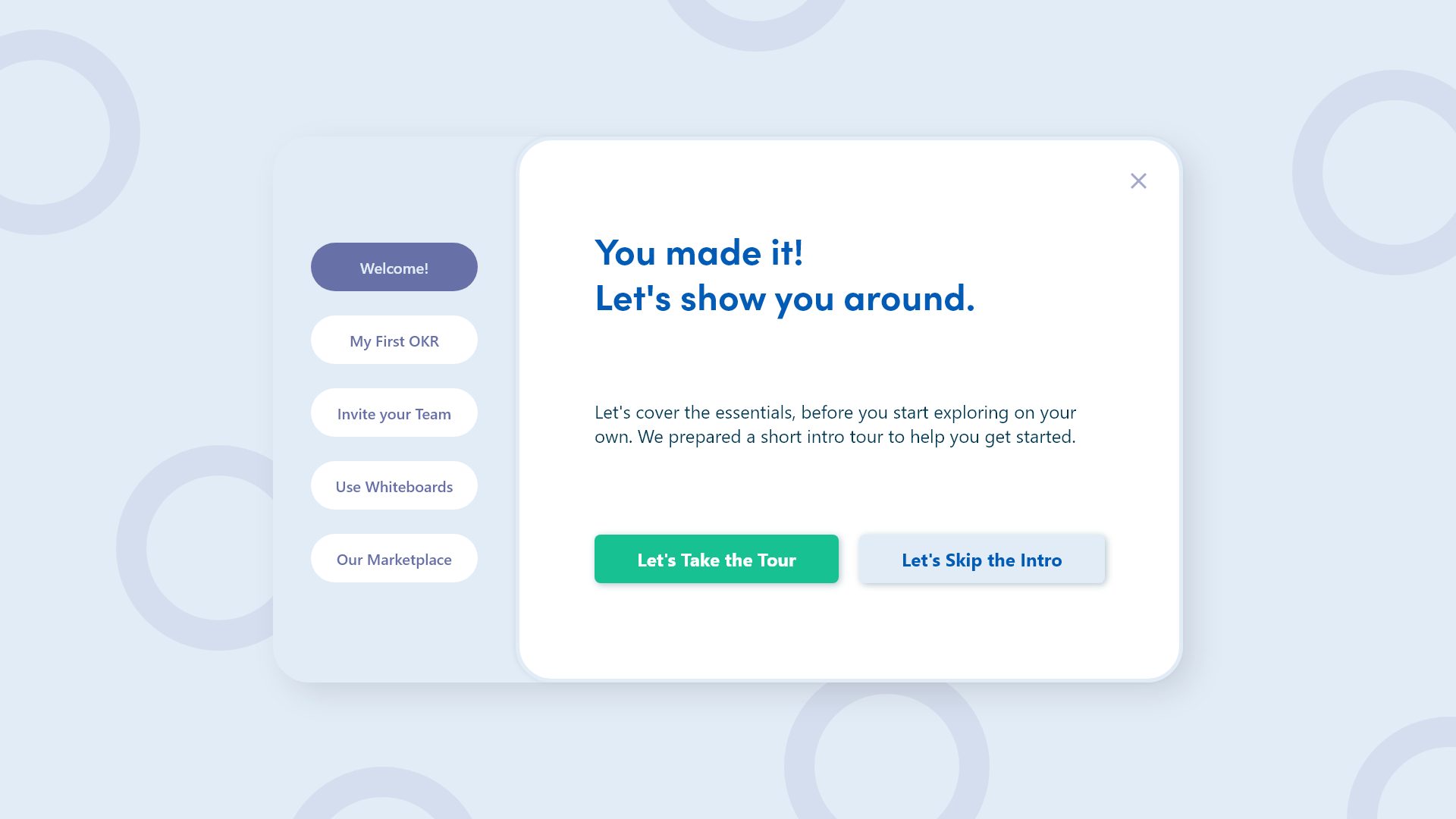
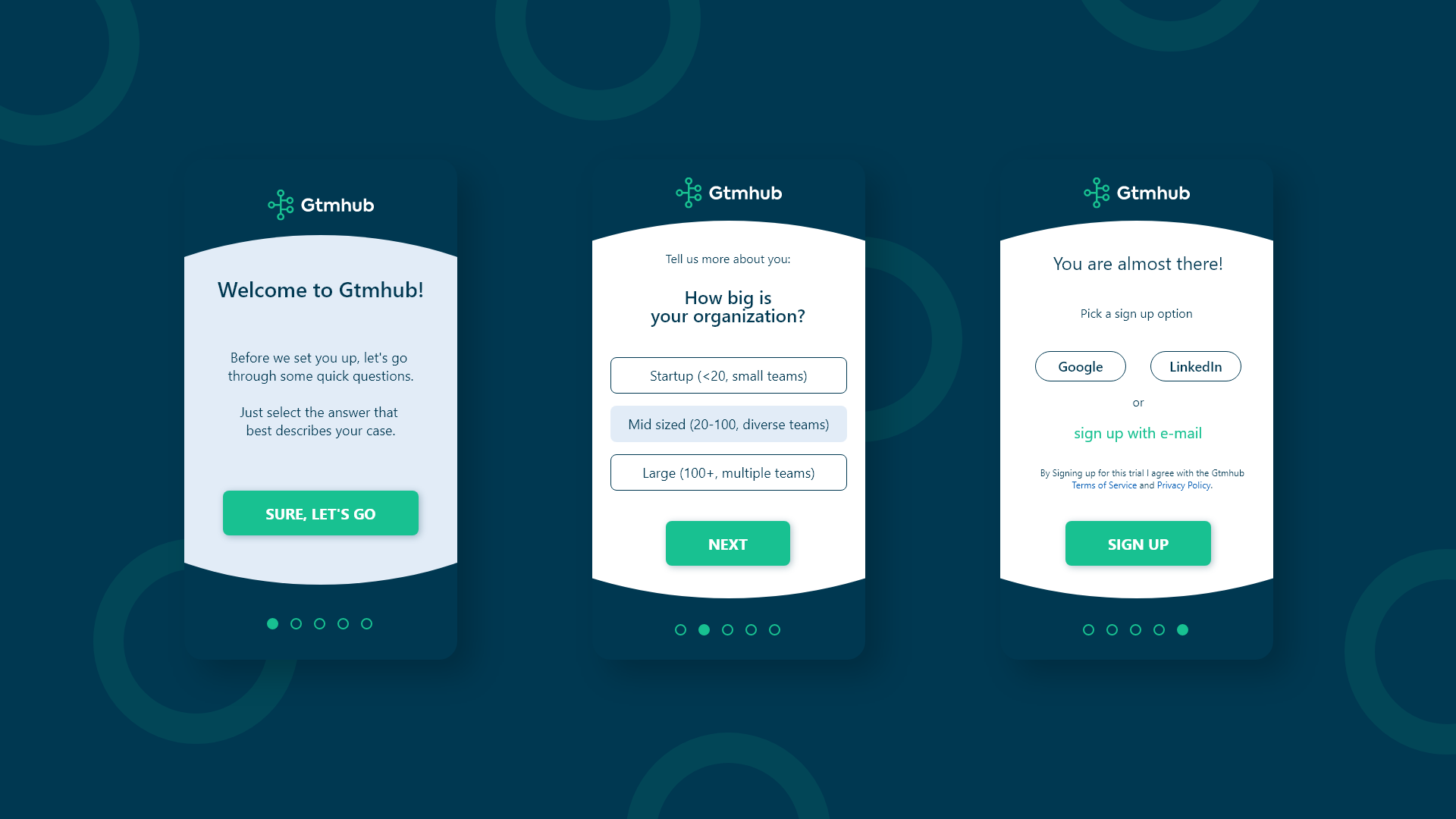
Gtmhub onboarding sequence starting with a welcome screen - proposed design.
The Assignment
The current offering, as outlined in the task, is targeted at large companies which have adopted the Objectives and Key Results methodology (OKR), and need a solution for tracking, alignment and automation. However, the focus is shifting to include smaller companies as well. Some of the key characteristics of the new target audience include little to none experience with OKRs and small company size (startups and SMEs).
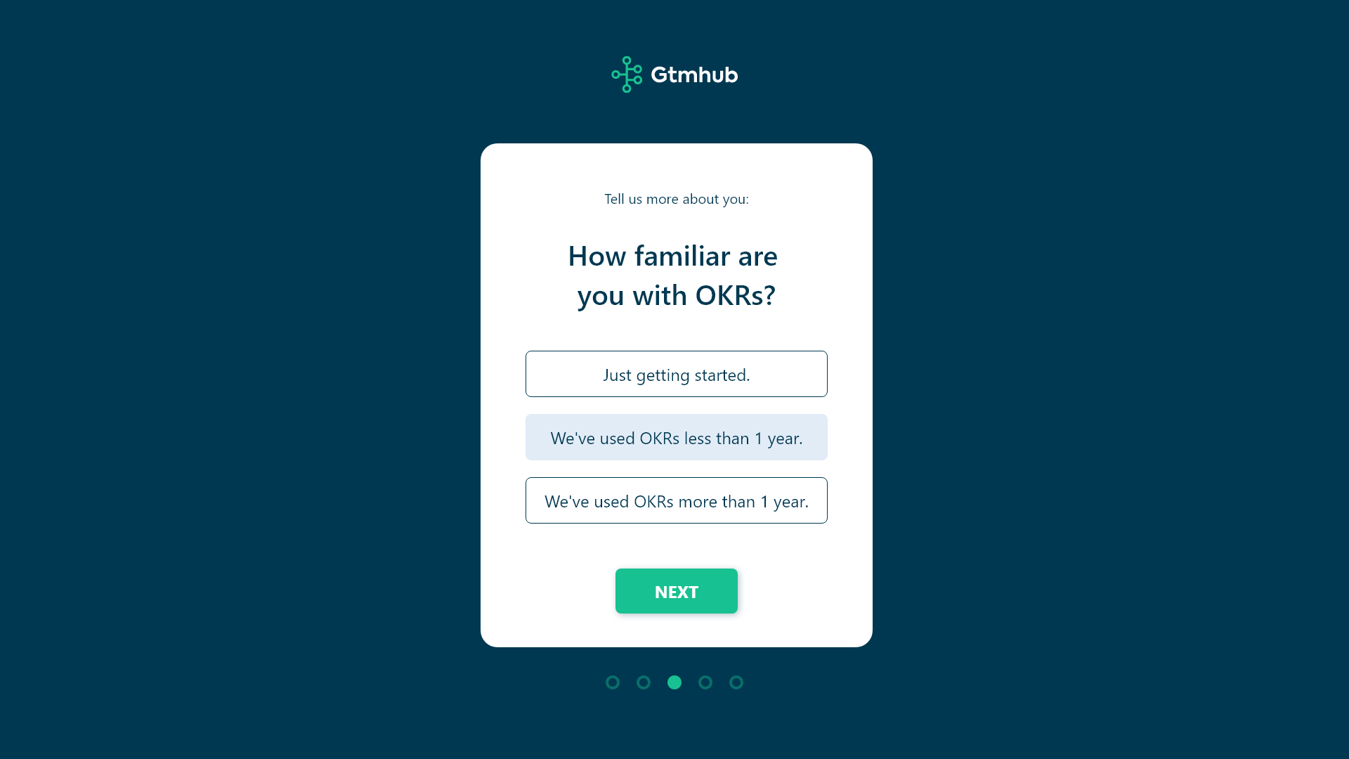
Persona defining question from the proposed design of the Gtmhub onboarding sequence.
The Current State
The process began with a quick test during which I signed up for a trial and checked the existing onboarding sequence, as well as the product tour afterwards. The current solution relies on a couple of persona defining questions that presumably allow the automatic assignment of a plan based on the given answers. Everything is contained within a single overlay screen and dropdowns are used for answer selection.

Signup options in the proposed design of the Gtmhub onboarding sequence.
The Proposed Solution
With the new audience in mind, I decided to redefine the questions. Also, I opted in for using more steps, while having a much narrower focus on each step. The estimation was for maintaining, if not lowering, the time for completion. I ended up with five screens in total. The sequence starts with a welcome message that explains briefly what follows. The next three screens are for the actual persona defining questions. The last screen contains the signup options (Google, social profile, and e-mail). Progress indicator is used as an additional visual cue.
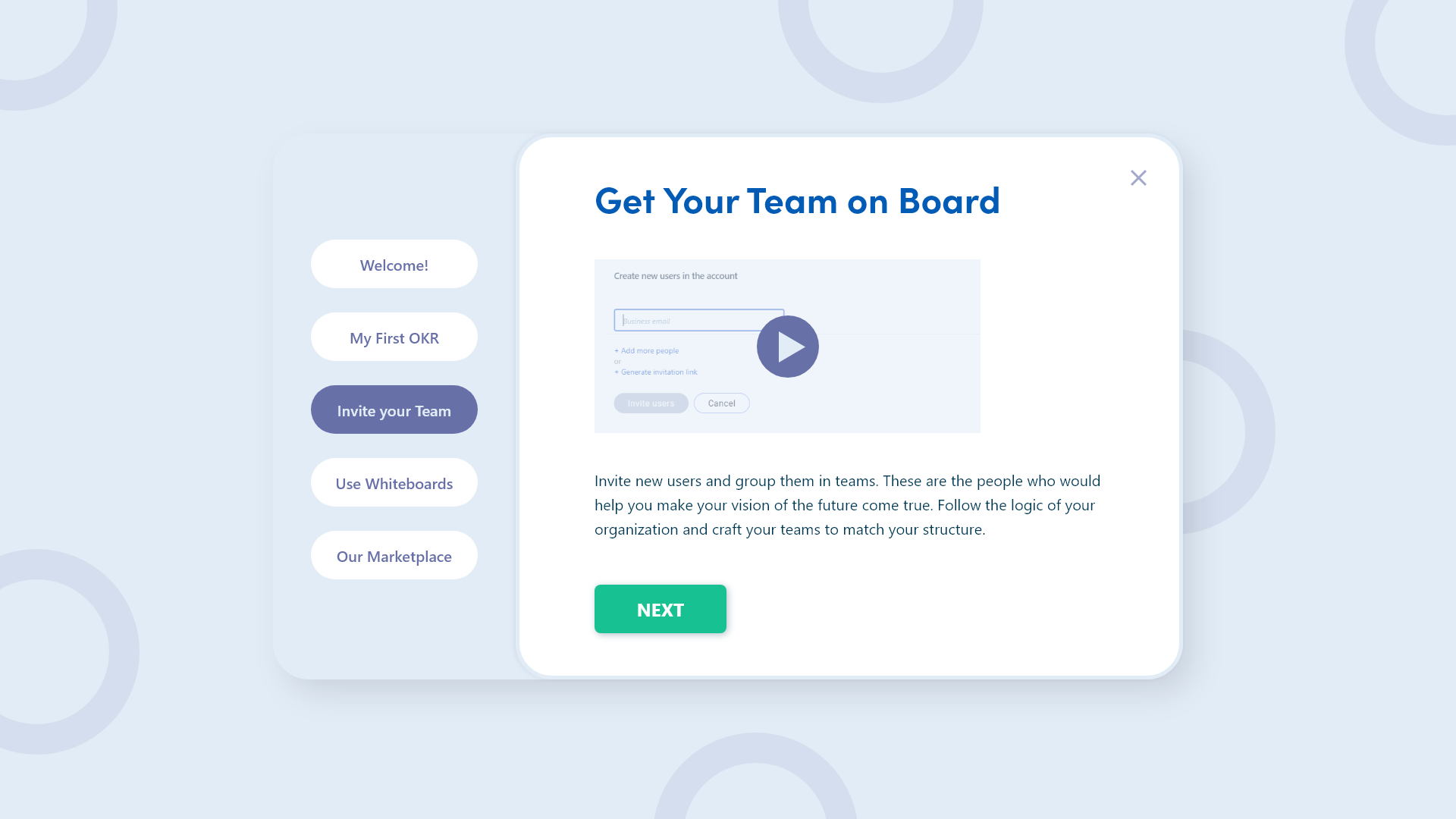
Product tour for the Gtmhub online platform - proposed design.
The Product Tour
For the product tour I decided to locate everything within a single overlay, as opposed to tooltips scattered all around the screen. Dismiss options are available during the entire sequence. The overlay is divided vertically, with chapter titles in the left column, and the actual content in the right one.
Product tour for the Gtmhub online platform - proposed design.
The chapter titles are clickable to allow easier navigation in case the user decides to not follow the designed linear sequence. A highlight is used to indicate the current location in the sequence. Additional buttons are used to progress further in the product tour, and these are placed in proximity to the content, to allow an easier flow.
Part of the Gtmhub onboarding sequence on mobile.
The assignment was openly published in a vacancy announcement on a recruitment website. Completion was mandatory for a qualifying application, therefore I didn't establish any contact with the company prior to submission. No NDA was signed during the process and I'm under no obligation to keep my work secret. To maintain brand consistency I used the Gtmhub logo and associated colors. With my work I clam no ownership over (or contribution to) the brand assets and original content by Gtmhub.