School Management System that Makes Vocational Training Easier
Project background
The purpose of this project is to automate school administration and trainee recruitment at CIFER, a Swiss school that provides vocational training to energy professionals.
CIFER is an educational institution located in Penthalaz in the canton of Vaud. The school is privately owned and the shareholders are Swiss energy companies. CIFER provides technical education for employees of the shareholders, as well as trainees from other companies.
While higher education (B.S.E) is not required for a variety of jobs in Switzerland, regular certification is mandatory for power grid workers. Company employees must participate in courses to get or renew their required certificates.
The challenge
Annual certification means repeat business and the school management has the agenda to make the sign up process as smooth as possible for trainees. The problem is that modern day admin systems have barely penetrated the market. Before adopting the ThirdBrain school management system CIFER relied on spreadsheets to handle daily tasks. Many other schools are in the same situation.
Our goal at ThirdBrain was to develop a system that allows the school administration to do several important tasks in their effort to automate the existing processes:
1. Painlessly import their endless spreadsheets into a database.
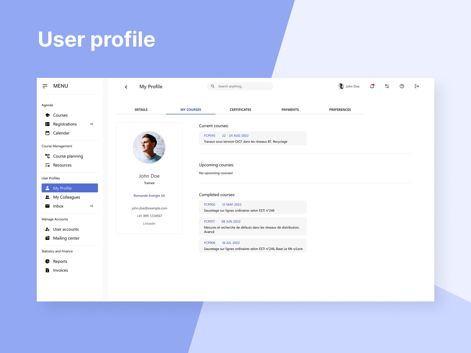
2. Add and edit user profiles via the interface, and not only via imports.
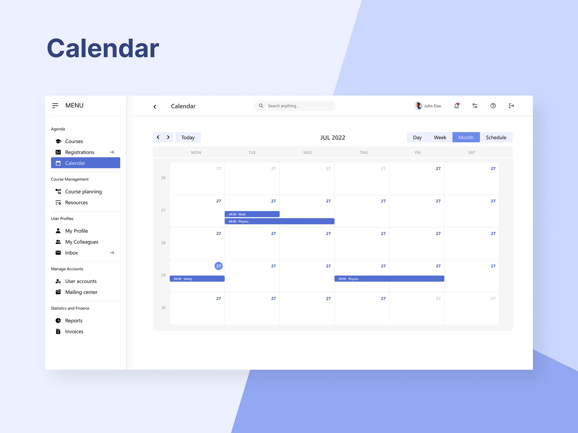
3. Manage resource availability: classrooms, workshops and trainers.
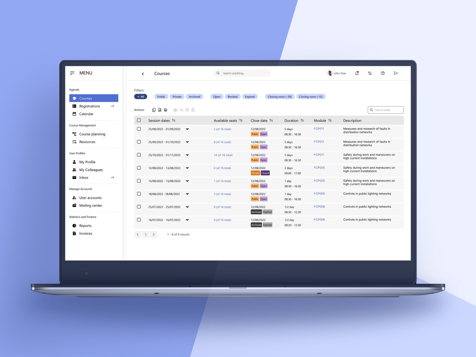
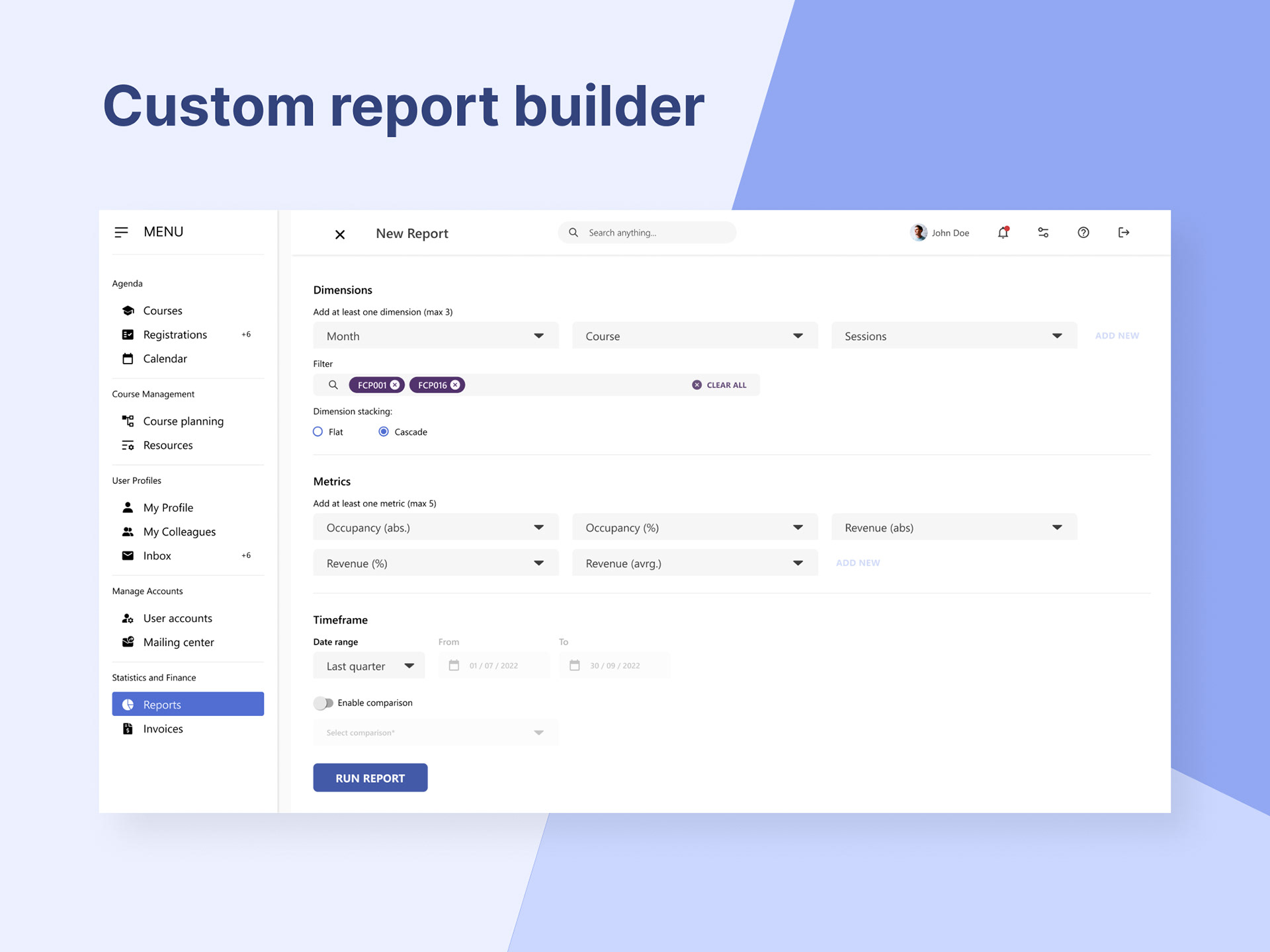
4. Process course registrations.
5. Create courses within the system, with attached resources.
6. Crete training sessions and manage seat availability.
7. Email groups and individuals from within the system.
8. Create, edit, and delete mailing groups, add or remove profiles to mailing groups.
9. Notify trainees for certificate expiration, thus ensuring repeat business.
10. Populate course info on the CIFER corporate website and allow individuals to sign up.
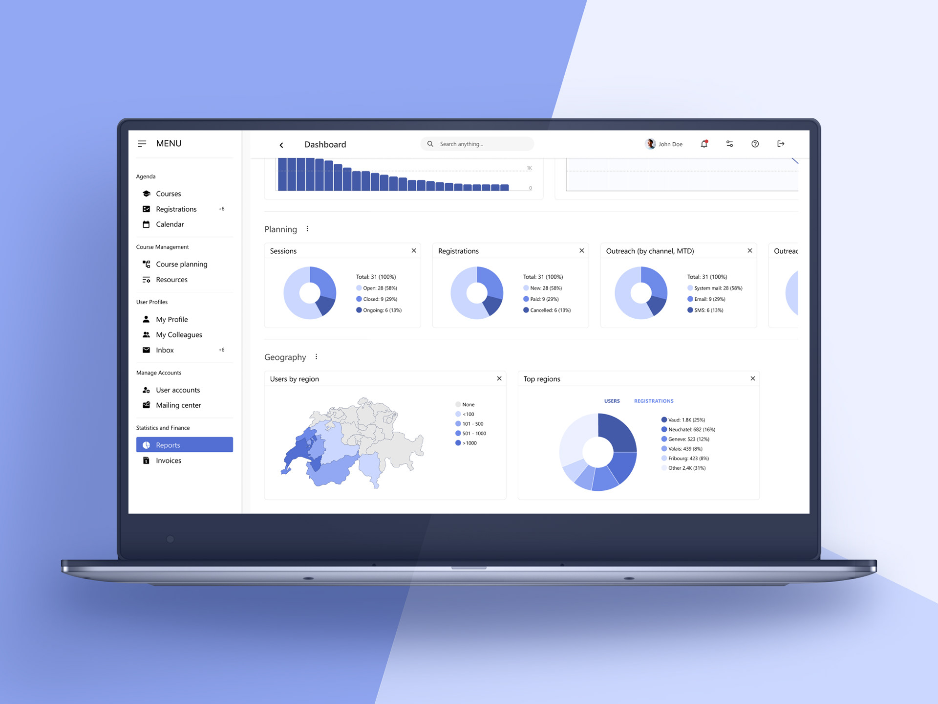
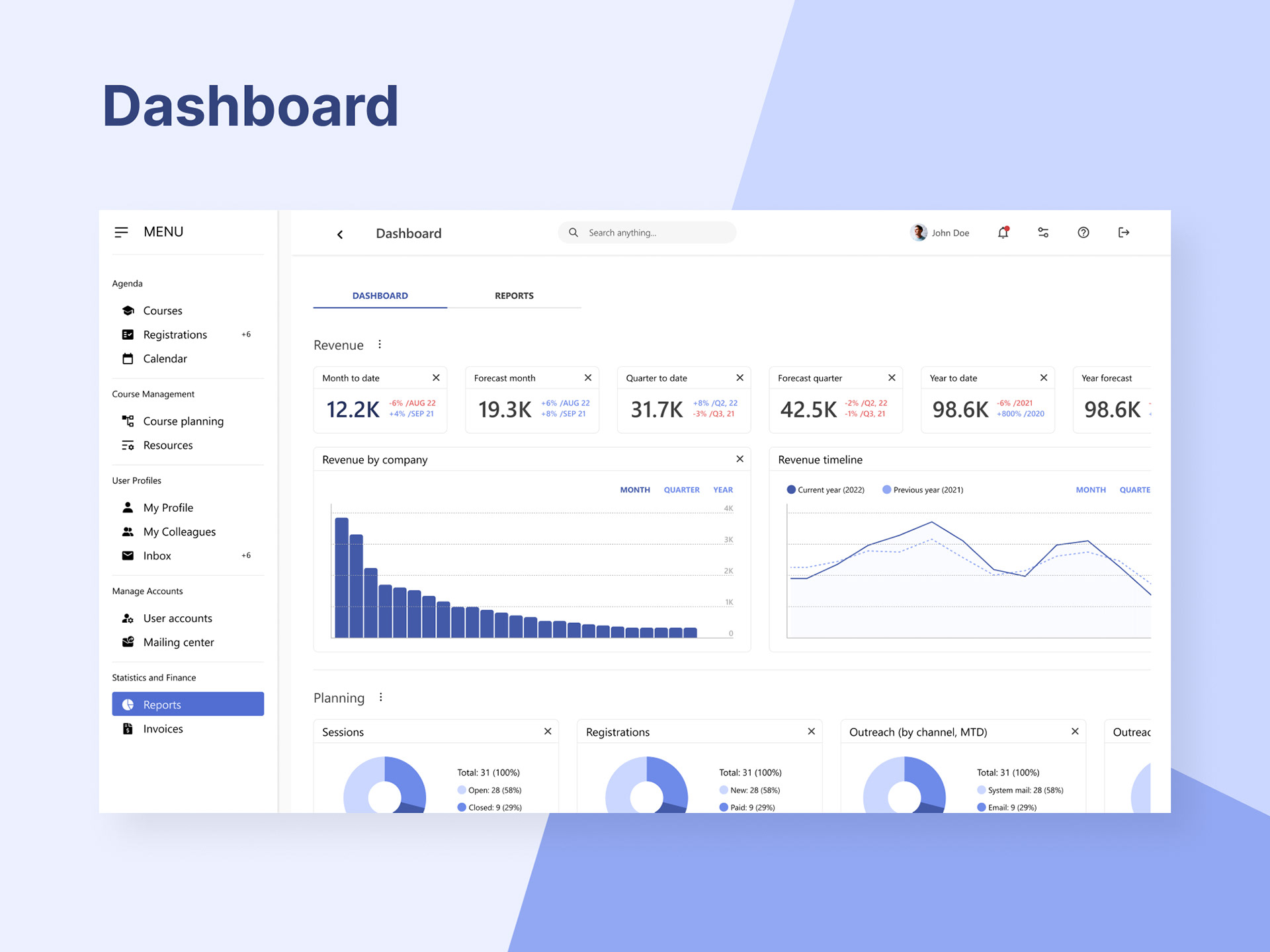
11. Run reports and get insights about availability and revenue.
The variety of required capabilities and the amount of processed data imply a great level of complexity. It requires rigorous planning of information architecture, navigation, system feedback, repeatable patterns and predictability, error prevention, and recovery from errors.
The solution
To help the client respond to these challenges, we developed an in-house system that works independently from third party frameworks. We adopted a doctrine based on self sufficiency and complete control.
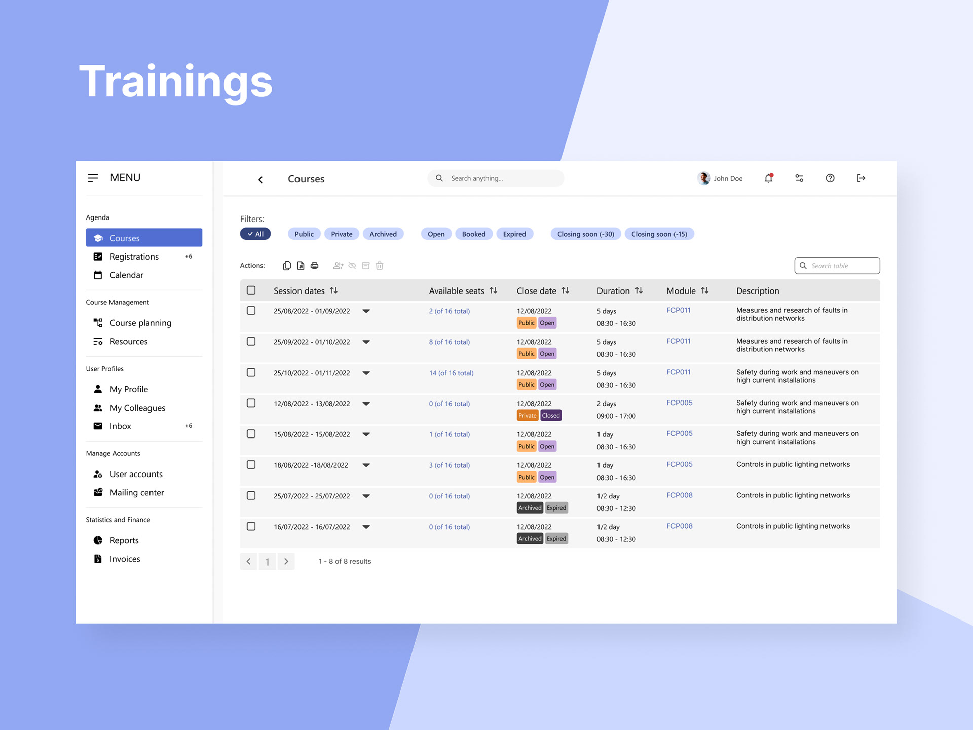
The result is a fast and robust modular system tailored to the client requirements and usable right out of the box. The system allows editing of individual entries as well as bulk actions to speed up mass edits.
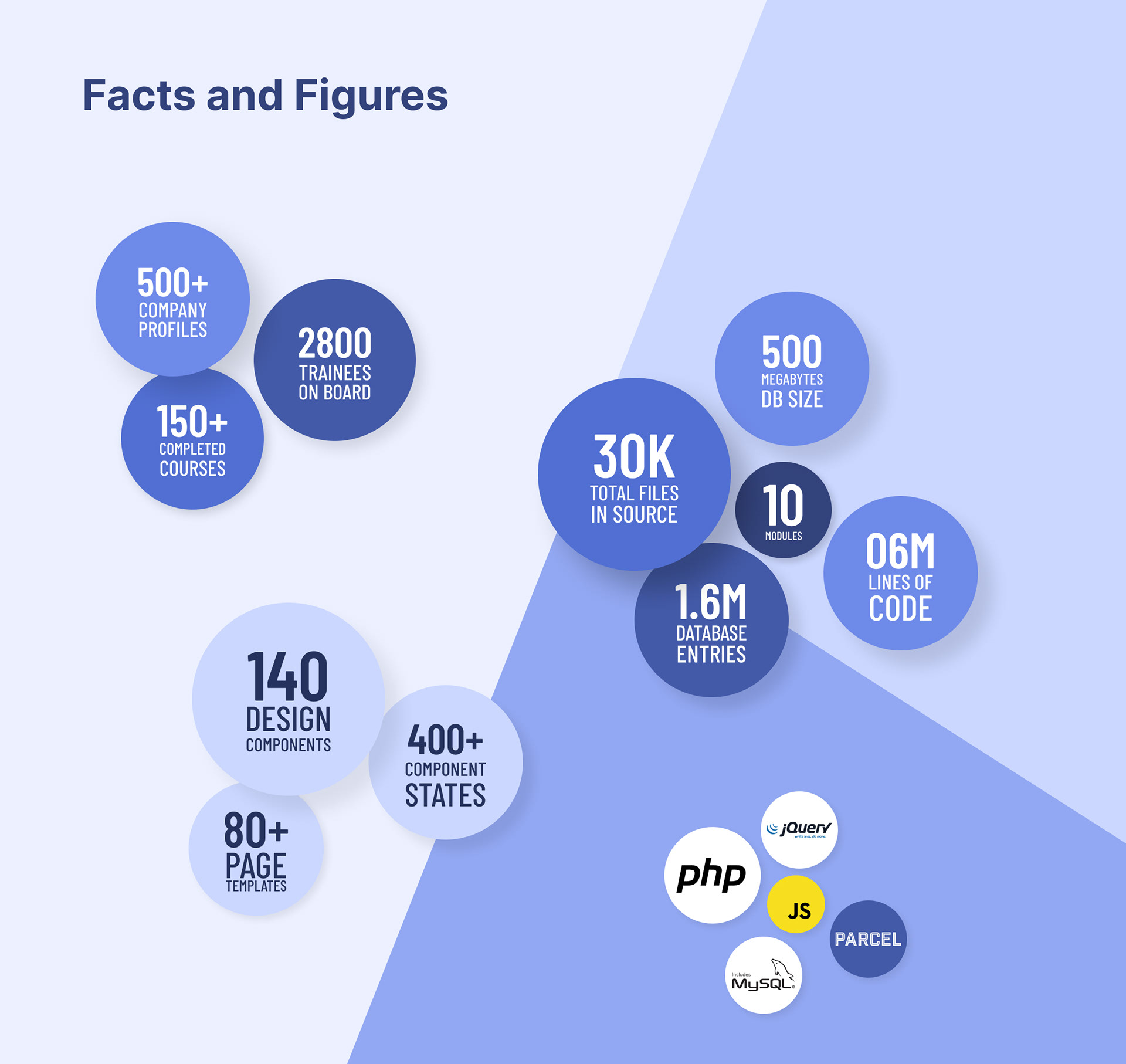
Component library
To ensure scalability, repetition and predictability we designed and built interface components based on the atomic design method. We started with the smallest inseparable components, states and micro interactions, and then combined them to build more complex structures and behaviors.

These building blocks contributed greatly in scaling process enabling us to quickly create and modify page templates.
Interface layout
Given the considerable content volume and variety of topics we opted for a permanent navigation drawer. It makes all top categories immediately available from anywhere in the system. Further separation of content within the main categories is enabled by the use of contextual tabs when needed.
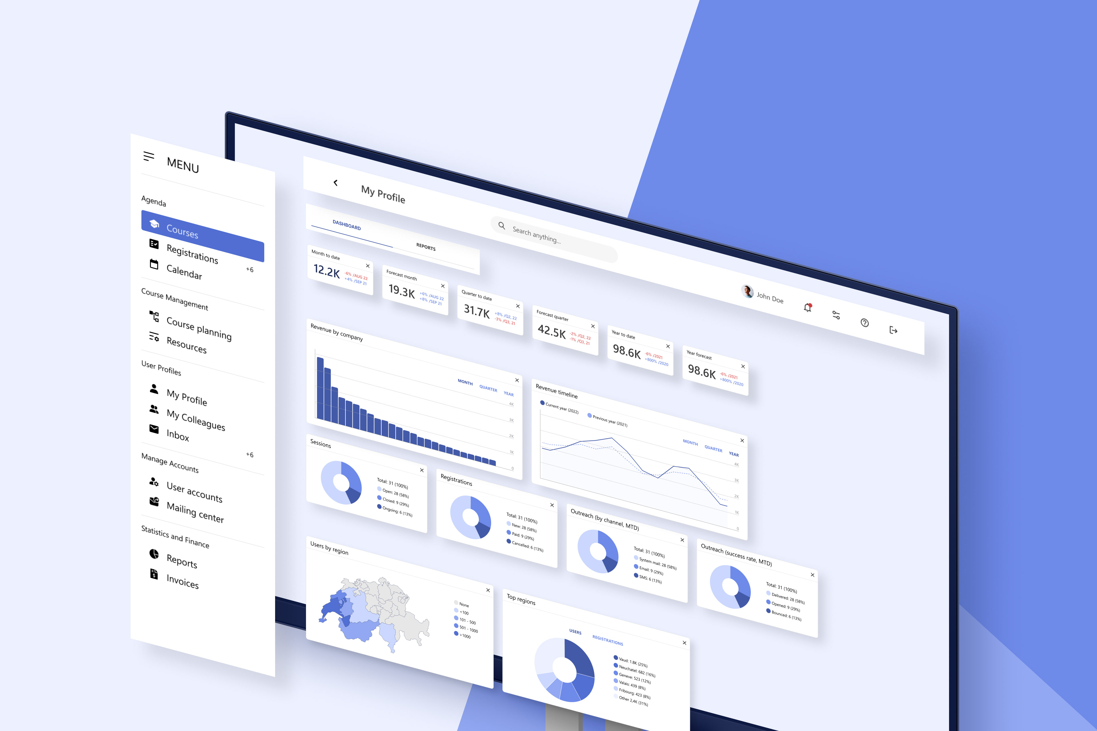
In addition, the users can search, and access settings, notifications and help documentation from the top app bar. The navigation drawer and the top app bar make the backbone of the interface and appear consistently in every page template.
Color palette
The color palette consists of five groups of colors, each based on the same hue, with varying saturation and lightness. This way we created enough variance to use whenever needed, without making any individual color mandatory.
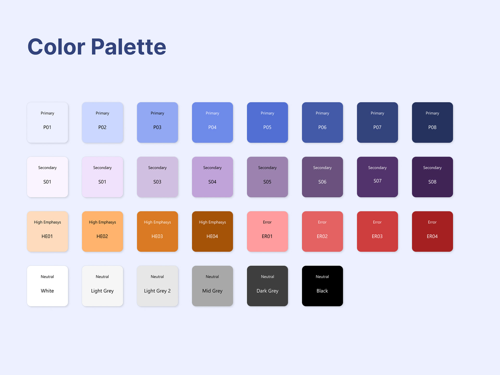
The color groups are:
1. Primary (8 variations) - used to indicate state and availability of main components that enable positive actions (e.g. buttons, floating buttons and filter chips).
2. Secondary (8 variations) - used in combination with the high emphasis and neutral colors to separate small local components, e.g. labels in a table.
3. High emphasis (4 variations) - used for labels that mark priority items within the content.
4. Error (4 variations) - used exclusively to highlight error related component states, and also destructive actions.
5. Neutral (6 variations) - used mainly for type and backgrounds, but also for inactive states and content labels.